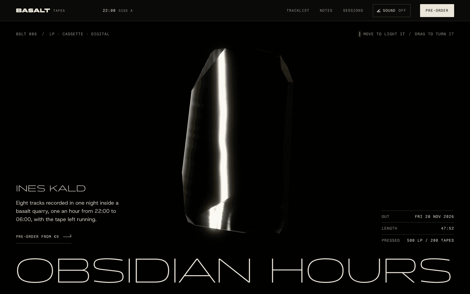
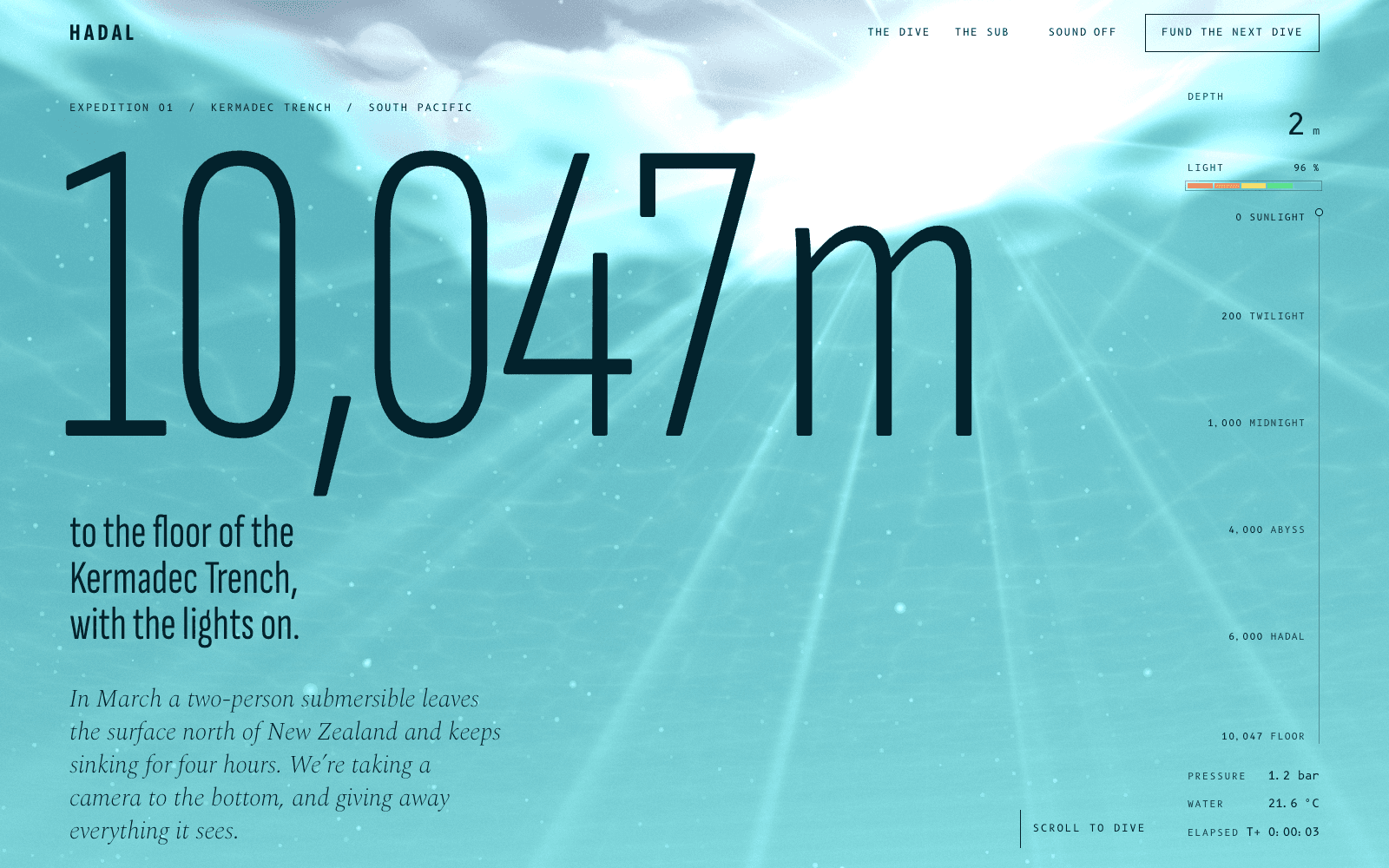
Animated website builder
Animated and interactive websites where each movement does a job: reveal, sequence, response or play. Laarpi's rules require a reduced-motion version that still works.
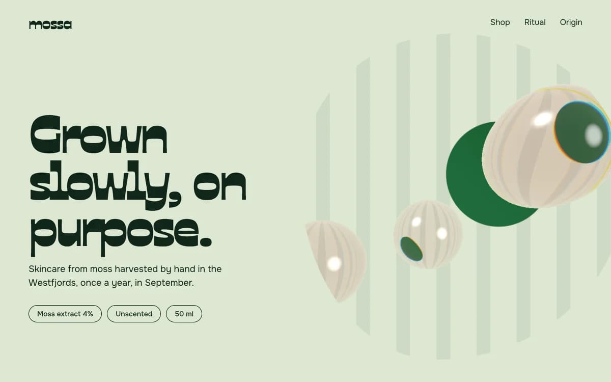
An animated website works when every movement does a job the page couldn't do standing still: it reveals how something is made, puts a story in order, answers the visitor, or lets them play. Motion without a job is decoration, and decoration is the fastest way to make a site feel cheap.
SI, Laarpi's agent, is built to plan motion that way. Before any code, the brief says what moves, what triggers it, and what would be lost without it. If nothing would be lost, it is cut.
Four jobs motion does
These four sites are concept sites the Laarpi team made with Laarpi's library and process. Each shows one job, and each has a write-up with how it was built.
Reveal: show what can't be seen
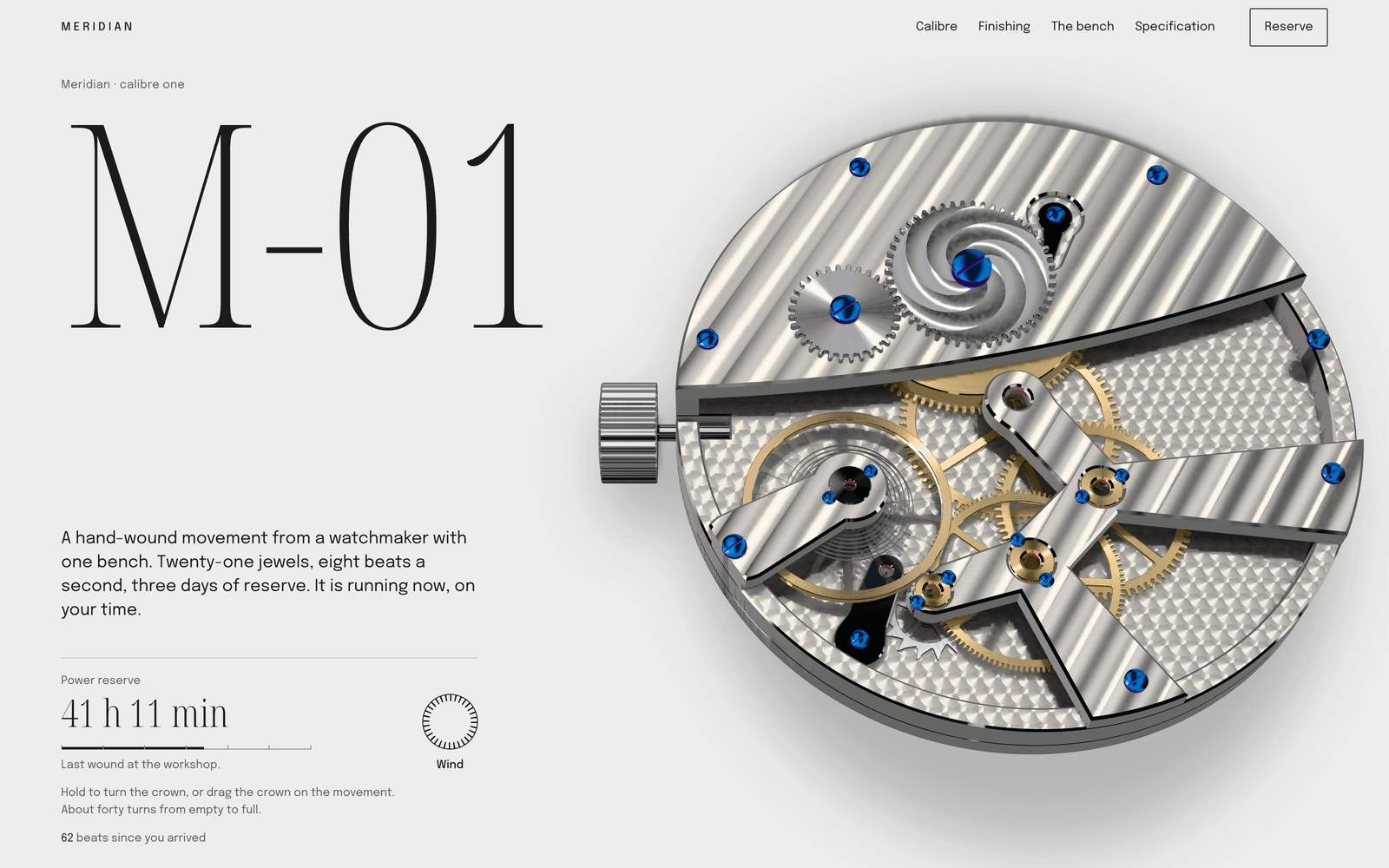
Meridian M-01 is a launch page for a watch movement. The calibre runs live at your own time; as you scroll, it comes apart in the order a watchmaker would service it, and macro lenses show the finishing on each part. Motion here does what a photograph can't: it shows how the parts fit.
Sequence: tell it in order
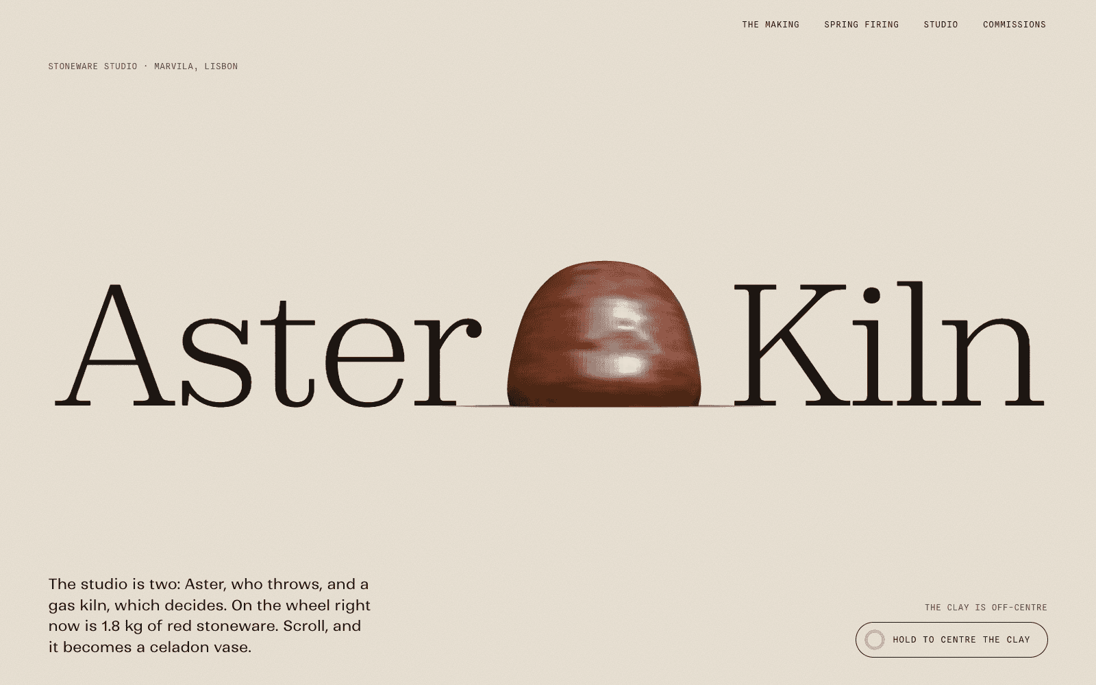
In Aster & Kiln, the visitor's scroll is the potter's hands. A wet lump of clay is centred, pulled, trimmed, glazed and fired into the vase the page then offers. The sequence is the argument: you have watched the work before you see the price.
Response: answer the visitor
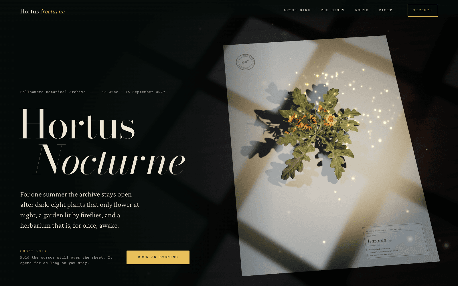
Hortus Nocturne is a night-garden exhibition. A scanned flower lies pressed on a herbarium sheet and stands up to bloom only while the visitor holds the cursor still. Sometimes the best response to the visitor is stillness.
Play: let them use it
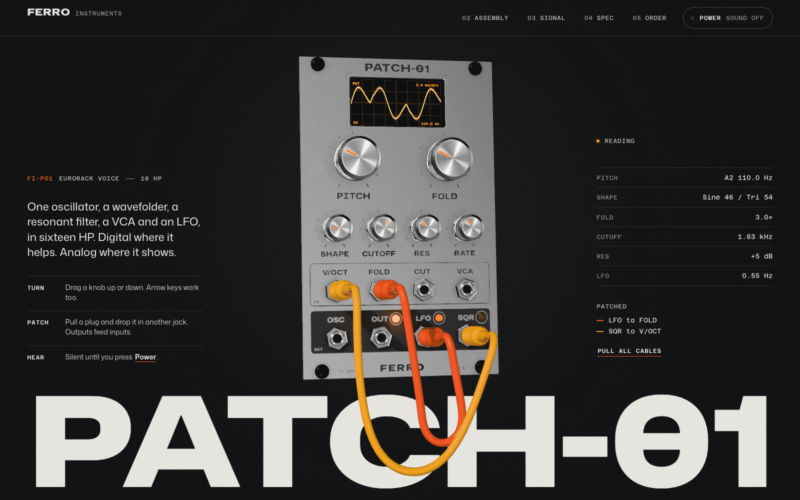
PATCH-01 is a synth module you can play in the page. Turn the knobs, patch the cables and hear it; the patch you make follows you down the page. People try the product before they read the spec sheet.
| Job | It's right when | It goes wrong when |
|---|---|---|
| Reveal | The product has an inside, a mechanism or a finish worth seeing | It reveals a logo or a stock photo |
| Sequence | There is a process with a real order | Pinned sections hold the screen long after the point is made |
| Response | The idea is about attention, light or care | Every element wobbles toward the cursor |
| Play | People want to handle the thing before buying | The toy hides the information they came for |
Type in motion
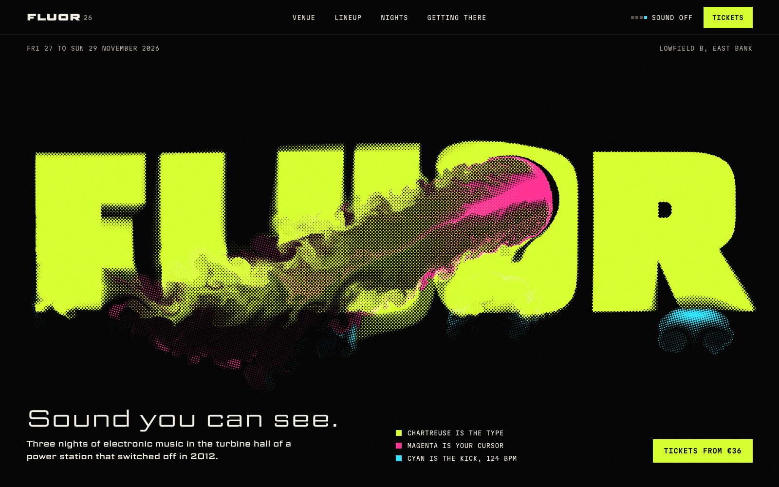
Kinetic type earns its place when the words are the subject: a festival lineup set at each artist's tempo, a manifesto that lands line by line, a label that scrambles into a technical reading. It hurts when it is applied to body copy people need to read.

The Kinetic Type direction is built around this: oversized type that moves with the scroll and stays legible at rest. A useful test is to pause any frame. If the headline can't be read in that frame, the motion is fighting the words.
How SI decides what moves
The brief carries a motion grammar for the whole site: one family of easing, a deliberate range of durations, what moves on scroll, what moves on hover, and what never moves. One grammar is what makes motion feel designed rather than collected. Swiss-style sites move hard and fast with no easing flourishes; quiet luxury sites barely move at all. Mixing the two weakens both.
SI works from Laarpi's library of motion techniques and is built to write each site's signature moment itself:
| Technique | Good for | Overused when |
|---|---|---|
| Line and word reveals | Headlines that should land | Every paragraph fades up |
| Pinned chapters | A process told in steps | The visitor feels stuck |
| Horizontal tracks | Collections and timelines | Essential content hides sideways |
| Scroll-velocity marquees | Lineups and loud brands | Used on a law firm |
| Magnetic buttons | One primary action | Every link pulls at the cursor |
| Page transitions | Multi-page sites with a strong identity | They slow every click |
On a Finish, a separate art-director review scores motion intent and reduced motion from screenshots, among eight scores, and the site is revised until each reaches 8 of 10 or the run's cap is reached. How Laarpi works explains the full process.
Motion everyone can use
Some people get dizzy or ill from motion on screen. A Finish checks every site with the operating system's reduced-motion setting switched on: smooth scrolling must be off, the page must be still at rest, and the layout must hold at desktop and phone width.
The showcase sites show what that looks like in code. This is part of Meridian's reduced-motion branch (trimmed and reformatted), which turns its pinned scroll chapters into ordinary sections with every step visible:
@media (prefers-reduced-motion: reduce) {
  .apart__pin,
  .bench__pin {
    position: relative;
    height: auto;
  }
  .steps li {
    position: static;
    opacity: 1;
  }
}
Nothing flashes more than three times a second, sound plays only after the visitor asks for it, and motion that runs on its own gets a pause control. The guide to accessible motion covers how to plan this for any site.
Speed: smooth is a requirement
Motion that stutters is worse than none. Laarpi's motion rules animate transforms and opacity, which the browser can composite without recalculating layout, keep scroll handlers light so taps and clicks answer quickly (what Google measures as Interaction to Next Paint), and pause 3D scenes when they leave the screen. A Finish measures a cold load on an emulated 4G phone and doesn't pass a site that is too heavy. For sites where the motion is a real-time scene, the 3D website builder page covers how scenes are kept light.
How to ask for motion
Describe the feeling and the trigger, not the effect:
- "Scrolling should feel like turning the pages of a catalogue."
- "The lineup should feel loud. Names at their tempo."
- "Calm. Almost nothing moves until you hover over a photograph."
After the build, steer it in plain words, such as slower, less on the body copy, or let the headline hit harder, or point at a section and change only that. Event sites are a natural fit for loud motion; see event websites.