Choosing fonts that aren't Inter
Why so many websites share the same handful of typefaces, how to choose display, text and label faces for a concept, sixteen tested pairings with reasons, and how to license and load them properly.
Scroll through a few dozen new websites and you'll see the same typefaces again and again: Inter for everything, or Inter with a fashionable serif for headlines. Roboto, Open Sans, Montserrat and Poppins fill in the rest. Each of these is a good typeface. Together, as defaults, they make the web look generated.
Type is the fastest way to give a site a voice, and it costs nothing: thousands of excellent typefaces are free for commercial use. This guide covers website font pairing with intent: how to choose faces for a concept, sixteen pairings we use with the reasons behind them, and how to license and load fonts properly.
Why everything looks the same
Defaults spread for good reasons. Inter is beautifully made for screens. Roboto ships with Android. Templates, design kits and code generators pick a safe face once, and then everything built from them inherits it.
The result is a monoculture. When the headline, body and buttons of a site are all set in the same face as thousands of others, the site has no voice before a word is read. That's why Laarpi's own quality checks treat Inter, Roboto, Open Sans, Lato, Montserrat, Poppins and the system fonts as errors when they're chosen as a site's display or text face, and flag tired pairings such as Instrument Serif with Inter, Playfair Display with anything, and Space Grotesk as a display face. None of these are bad typefaces. They've just stopped saying anything.
Three roles, three different jobs
Most sites need type for three roles. Choose each for its job.
| Role | Its job | What to look for |
|---|---|---|
| Display | Headlines, wordmarks, big numbers: the voice | Character, drama at large sizes, a shape that suits the concept |
| Text | Paragraphs, captions, UI: reading | A generous x-height, open shapes, several weights, a real italic, your languages |
| Mono or label | Numbers, data, labels, metadata | Clear figures, tabular numerals, a texture that contrasts with the text face |
The display face carries the identity. The text face carries the reading. Spend your boldness on the first and your care on the second.
Choose from the concept, not the catalogue
The best type choices start from the idea of the site, not from a list of popular fonts. Ask what the subject is made of, when it's from and how it would speak. Some examples from showcase sites made by the Laarpi team with Laarpi's library and process, with the reasoning from their plans:
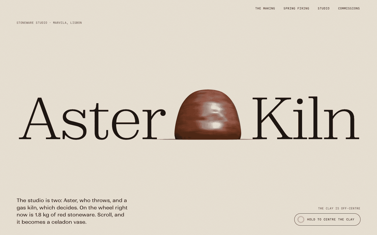
- Aster & Kiln (ceramics): Zodiak Light for display, Ranade for text, Spline Sans Mono for labels. A high-contrast serif with calligraphic italic numerals for the kiln temperature; a humanist sans with a little brush in it; a mono like a kiln log.
- BASALT Tapes (record label): Panchang 200 for display, Host Grotesk for text, Fragment Mono for labels. An extended hairline over a heavy black object; a quiet grotesk for reading; a mono for hours and catalogue numbers like a specimen label.
- FLUOR 26 (music event): Science Gothic for both display and text, Martian Mono for labels. One family from 50% to 200% width: signage at one end, a synth panel at the other; each artist is set at a width matching their tempo.
- HADAL (deep-sea dive): Sofia Sans Extra Condensed for display, Spectral for text, B612 Mono for labels. A tall face as vertical as the water column, its weight rising with pressure; a documentary narrator's serif; a mono drawn for aircraft cockpit displays.
- Hortus Nocturne (night garden): Bodoni Moda for display, Crimson Pro for text, Courier Prime for labels. A Didone of the era of the botanical plates it references, with true italics for Latin names; a quiet book serif; a typewriter mono for accession numbers.
- PATCH-01 (synthesizer): Hubot Sans for display, Mona Sans for text, Azeret Mono for labels. Squared, machined curves that read like engraving; its sibling for calmer copy; tabular figures like an instrument display.
Notice that every choice has a reason a stranger could follow. "It looks nice" isn't a reason. "It looks like engraving on an aluminium panel" is.
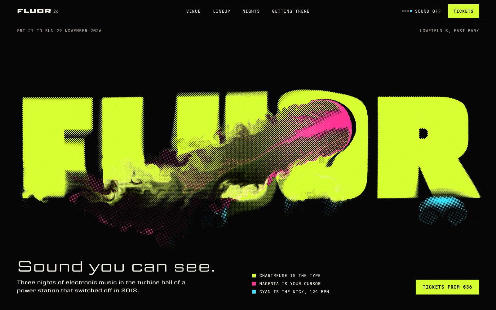
FLUOR's wordmark is the clearest example of type as concept: a variable width axis lets the word solve its own width and fill any frame, and the same axis sets each artist on the lineup at their tempo.
Sixteen pairings with reasons
Laarpi's style catalogue pairs a display and text face for each of its sixteen directions. They're good starting points, and the specimens show them in use.
| Direction | Display | Text | Suits |
|---|---|---|---|
| Swiss Brutal | Archivo | Host Grotesk | Architecture, engineering, design studios |
| Editorial Luxe | Bodoni Moda | Newsreader | Fashion, culture, long reads |
| Kinetic Type | Unbounded | Familjen Grotesk | Events, brands, anything loud |
| Liquid Chrome | Syne | Satoshi | Product launches, audio, hardware |
| Analog Warmth | Fraunces | Hanken Grotesk | Food, craft, places with a story |
| Gallery White Cube | Instrument Serif | Switzer | Galleries, artists, photography |
| Cinematic Noir | Gloock | Erode | Film, bars, night-time places |
| Retro-Futurist Terminal | Martian Mono | Chivo Mono | Developer tools, space, data |
| Organic Biomorph | Ojuju | Onest | Skincare, biology, wellness |
| Acid Rave | Climate Crisis | Schibsted Grotesk | Clubs, festivals, labels |
| Botanical Archive | Cormorant Garamond | Instrument Sans | Museums, archives, gardens |
| Industrial Spec Sheet | Big Shoulders Display | Archivo | Tools, bikes, outdoor gear |
| Playful Toybox | Bagel Fat One | Figtree | Kids' brands, games |
| Quiet Luxury | Boska | General Sans | Hotels, interiors, fine dining |
| Riso Zine | Bowlby One | Zilla Slab | Zines, fairs, independent shops |
| Dimensional Pop | Tilt Warp | Rethink Sans | Playful product launches |
Every direction has a page of its own in the styles hub, with its palettes, layout, motion and a rendered specimen.
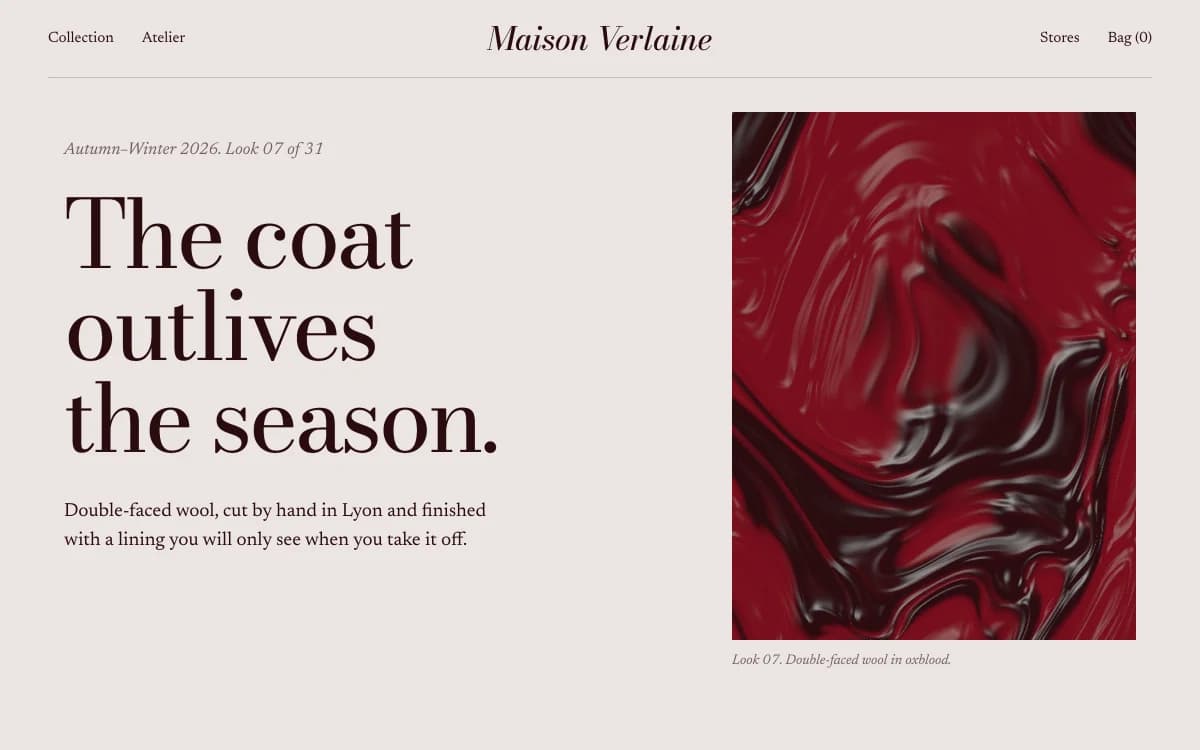
Editorial Luxe shows a Didone at extreme size. Didones need room: their hairlines vanish when they're small, so they belong at headline sizes, with a sturdier serif such as Newsreader for reading.
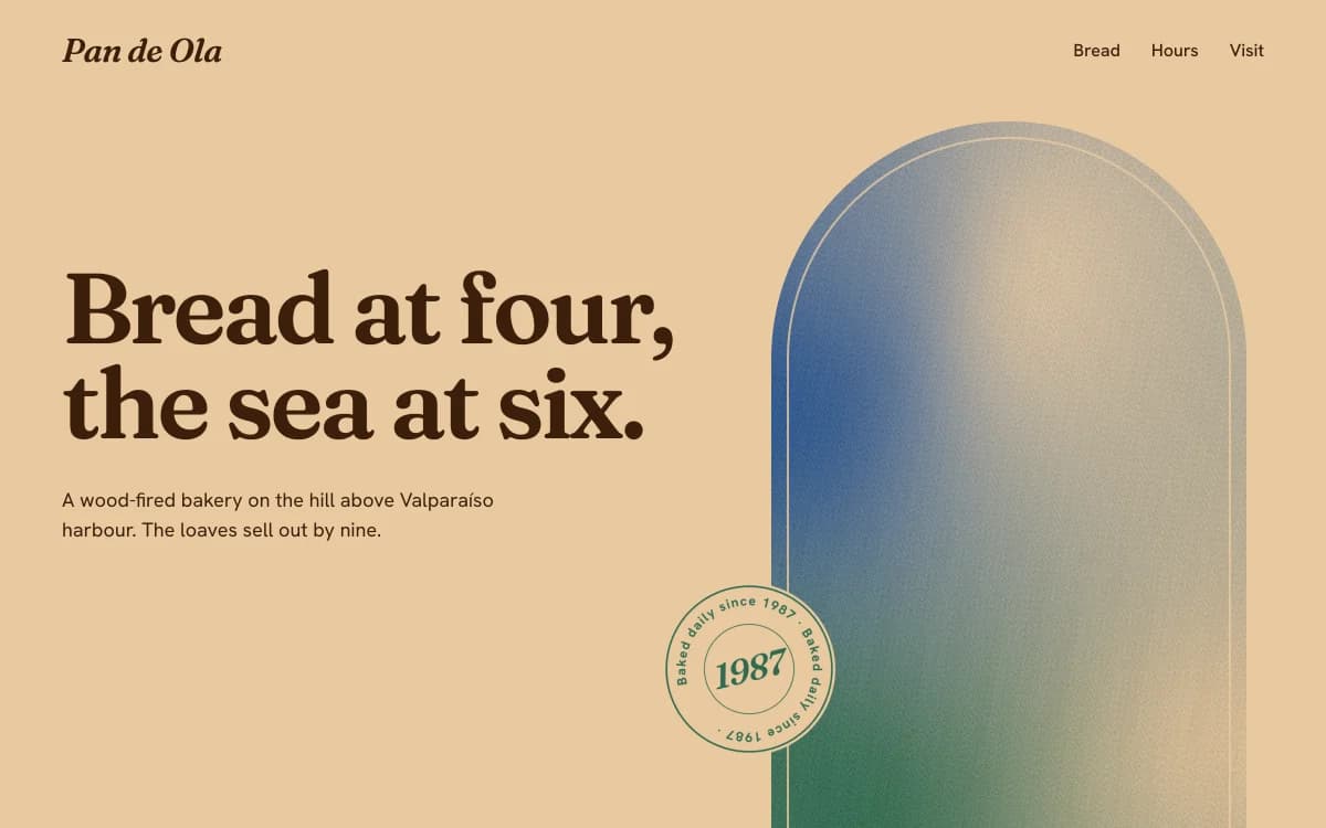
Analog Warmth uses Fraunces, a variable serif with axes for softness and "wonkiness" as well as weight and optical size, so one family can go from crisp to soft and slightly odd, like letterpress.
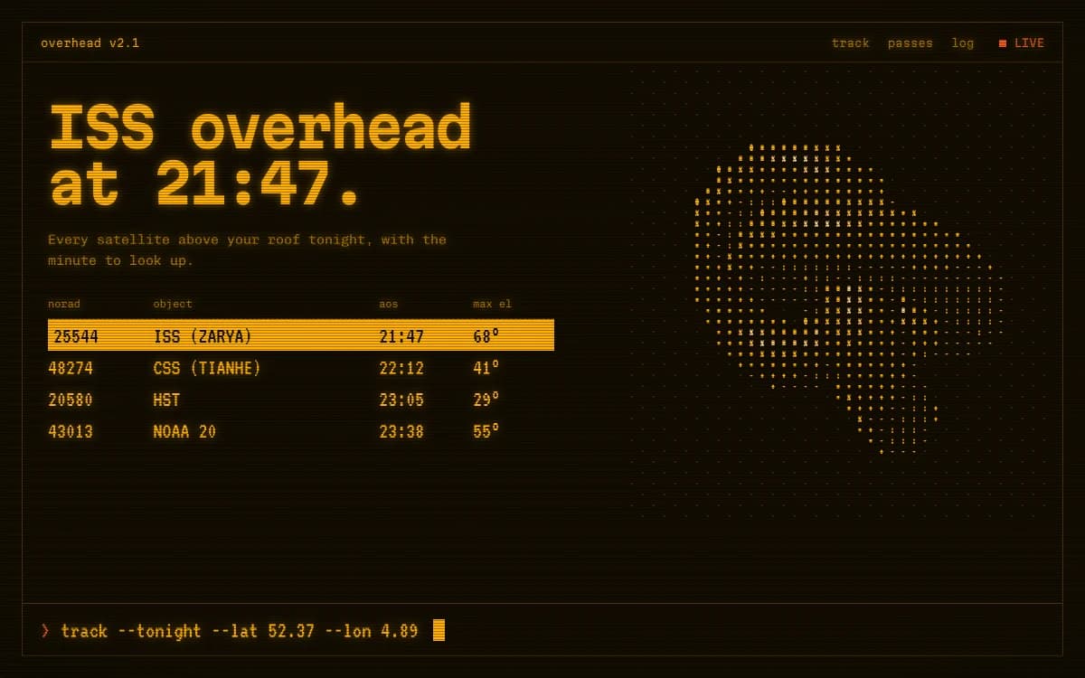
Retro-Futurist Terminal sets almost everything in monospace. That only works when the concept is a console; as a habit, mono-uppercase labels everywhere have become a cliché of their own.
Choosing a text face
A display face can be eccentric. A text face has to disappear while people read. Test candidates properly:
- Set a real paragraph at 16–18 pixels on a phone and at your desktop measure (around 60–75 characters per line).
- Check the x-height and apertures. Taller lowercase and open shapes read better on screens.
- Check the italic. A real, drawn italic is a sign of a serious family.
- Check the numerals. Do you need tabular figures for tables and prices, or old-style figures for prose?
- Check your languages, including accented characters and any non-Latin scripts you need.
Pairing principles
- Contrast in one dimension, kinship in another. A serif display with a sans text works when they share proportions or era. Two faces that differ in everything look accidental.
- Let one face lead. If the display face is loud, the text face should be quiet.
- Consider one family. A variable family with width or optical-size axes can do display and text, as FLUOR and PATCH-01 do with Science Gothic and the Hubot and Mona superfamily.
- Watch the overused pairings. A pairing that appears on every new site has stopped carrying meaning.
Licences
Free doesn't mean unlicensed. The two main free sources:
- Google Fonts: open licences, mostly the SIL Open Font License, which allows commercial use, modification and self-hosting.
- Fontshare: free fonts from the Indian Type Foundry under the ITF Free Font License, which allows commercial use.
Read each family's licence, keep a record of what you used, and never use fonts from sites that redistribute commercial typefaces without permission. Laarpi chooses families from Google Fonts or Fontshare and confirms each one exists before using it; if you have a licensed brand font, upload it as WOFF2 and it will use that instead.
Loading fonts fast
Custom fonts cost bandwidth and can shift layouts. Do this:
- WOFF2 only, and only the weights and styles you use.
- Variable fonts when you need three or more weights of one family.
- Preload the face for your first headline, so the most visible text appears in its real form quickly.
- Match fallback metrics, so the page doesn't jump when the font arrives:
@font-face {
  font-family: "Display Fallback";
  src: local("Georgia");
  size-adjust: 104%;
  ascent-override: 92%;
}
h1 { font-family: "Bodoni Moda", "Display Fallback", serif; }
More on keeping visual sites fast in website performance with 3D.
Setting display type that never breaks
Big type fails in a specific way: a headline breaks in the middle of a word at some screen width nobody tested. Prevent it in CSS:
h1, h2 {
  overflow-wrap: normal;
  word-break: keep-all;
  hyphens: none;
  text-wrap: balance;
}
.wordmark { white-space: nowrap; font-size: clamp(3rem, 14vw, 12rem); }
Then check at several widths. Laarpi checks every site at 1920, 1440, 1280, 1024, 768 and 390 pixels, and treats any word broken across lines as a defect to fix.
How Laarpi chooses type
Laarpi is a coding agent that designs sites from scratch, and type is one of the first decisions it makes for each one. It chooses faces for the concept, writes down the reasoning in the plan you can edit, confirms each font exists, and avoids the defaults and overused pairings above. When it asks you about type before building, the options arrive as real specimens, set in the actual fonts, so you choose by seeing rather than by reading names. If you'd rather decide, name the fonts or upload your own. More on how it works on the AI website builder page, and how type fits a portfolio in a portfolio that gets you hired.