Organic Biomorph: a website that feels alive
A style for skincare, botanical, ocean and life-science brands that should feel alive. How soft, living forms are built without crude stand-ins, the palettes and type behind them, and where the style goes wrong.
Palette and type
Palette
- Ground#DCE7D2
- Surface#CED9C5
- Ink#10261A
- Muted#536657
- Accent#1F6B3A
- Accent 2#E8553D
- Line#B3C0AD
Chlorophyll
Pale leaf ground with a forest ink; the green accent stays inside the family, and a single tomato red marks the thing to click.
- Ground#0F2A1D
- Surface#223C2E
- Ink#E6F3DE
- Muted#819583
- Accent#FF6FB5
- Accent 2#D8F15A
- Line#435A4B
Forest neon
Night-forest green ground with a pale moss ink; neon pink and lichen yellow like festival lights strung in trees.
- Ground#062A3A
- Surface#193C4A
- Ink#D9F0F0
- Muted#7A979E
- Accent#FF6F59
- Accent 2#2DE1C2
- Line#395A66
Deep sea
Abyssal teal with bioluminescent ink; coral and cyan glow like things that live down there.
Type
Organic Biomorph
Ojuju
Soft, living forms: refractive blobs, flowing ribbons and sculptural lettering on leaf, moss and deep-sea grounds.
Onest
- Layout
- Curving rhythm: offset features, drifting collages, chapters beside a living stage; rounded radius allowed.
- Motion
- Glass-blob and ribbon-flow fields, slow parallax drift, gentle mask reveals.
Try it with a prompt
“A skincare brand made from moss harvested by hand once a year in the fjords. Slow, calm, a little strange.”
Start building in Organic BiomorphOrganic Biomorph is built from things that seem to grow. Refractive drops that melt into one another. Silk ribbons drifting through the frame. Lettering with sculptural, cell-like curves. Grounds the colour of leaves, moss and deep water.
Where most websites are built from boxes, this one is built from forms.
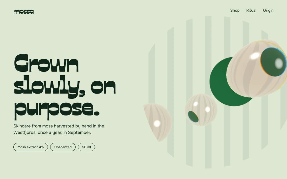
The specimen, for a fictional skincare brand made from hand-harvested moss, pairs "Grown slowly, on purpose." in a sculptural display face with a cluster of glassy forms drifting over a pale leaf-green ground, and three small pill labels for the product facts.
Where it comes from
Biomorphism is an old idea in modern art. In the twentieth century, sculptors and painters such as Jean Arp and Henry Moore made abstract forms that read as bodies, seeds and stones. In the late 1990s architects took it into buildings with curving, computer-designed shells.
On the web, it became practical once browsers could render refraction and soft deformation in real time. Organic Biomorph uses that to make forms that move like living things: slowly, with weight, and in response to the visitor.
What defines it
| Element | The Organic Biomorph choice | Why |
|---|---|---|
| Forms | Refractive drops, ribbons, cell-like shapes | Growth instead of construction |
| Layout | Curving rhythm: offset features, drifting collages, chapters beside a living stage | Order underneath, movement on top |
| Type | A sculptural display face and a calm, slightly rounded text sans | Letters that feel grown, text that stays quiet |
| Colour | Leaf, moss, deep sea, with one bright bloom | Nature's palette, with a flower in it |
| Radius | Rounded corners allowed | The one direction where softness is the point |
| Motion | Slow drift, gentle parallax, soft mask reveals | Living things do not snap |
Palettes
| Palette | Ground | Ink | Accent | Character |
|---|---|---|---|---|
| Chlorophyll | #DCE7D2 | #10261A | #1F6B3A | Pale leaf with forest ink; one tomato red marks what to click |
| Forest neon | #0F2A1D | #E6F3DE | #FF6FB5 | Night-forest green with neon pink and lichen yellow |
| Deep sea | #062A3A | #D9F0F0 | #FF6F59 | Abyssal teal with bioluminescent coral and cyan |
Type
- Display: Ojuju. A display face with organic, sculptural forms inspired by uli, a traditional Igbo art of flowing line. It is distinctive and warm, and unlike anything on a typical website.
- Text: Onest. A calm, slightly rounded sans that stays out of the way.
A face like Ojuju is a strong flavour. It is used for statements and the brand name, never for long text.
Motion and depth
The 3D here is abstract and procedural, which suits the subject: living forms are better suggested than modelled badly.
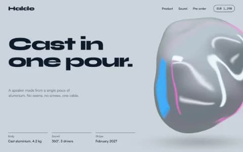
- Glass blob: thick refractive drops that melt together and bend whatever sits behind them, with rainbow dispersion and a hard specular streak.
- Ribbon flow: a bundle of satin ribbons swelling together, each twisting on its own, parting around the cursor.
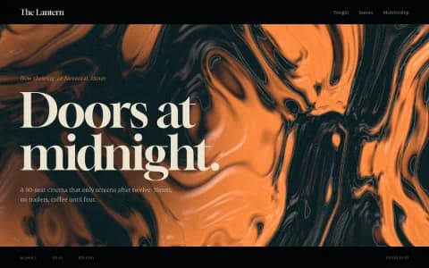
- Liquid field: pigment rivers that the cursor stirs into slow vortices.
Everything drifts slowly. Parallax is gentle. With reduced motion switched on, the forms hold one composed frame.
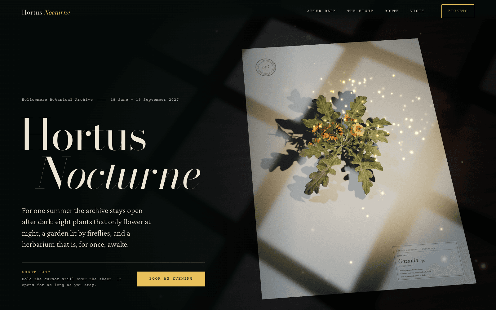
The rule that keeps it honest: never build a plant or a creature out of primitive shapes. A flower made of cylinders and flat ellipses is exactly the crude stand-in Laarpi refuses. Either use a real scanned specimen, as the night-garden site in the community does, or abstract it into light, glass and ribbon.
A typical page, section by section
Every site is designed for its own idea, so treat this as a sketch, not a template. A page in this style often runs like this:
- The living stage. Headline beside a cluster of glassy forms or drifting ribbons.
- Offset features, each fact or ingredient set beside a different, slowly drifting form.
- Chapters beside the stage: the story told in short sections while the forms change shape behind it.
- A drifting collage of photographs at different heights and gentle parallax.
- The call to action on a deep ground, with the forms gathering around it.
Fewer sections suit this style. Living things need room.
Who it suits
| A strong fit | A poor fit |
|---|---|
| Skincare, wellness and natural products, including small online stores | Engineering, finance and law |
| Biotech and life-science launches | Brands built on precision and data |
| Ocean, climate and conservation projects | Loud event promotion |
| Florists, gardens, tea and botanical brands | Sites with dense information |
More on these in the use cases for brand websites and product launch pages.
How it goes wrong
- Blobs as wallpaper. A random gradient blob behind every section is the generated-site version of this style. The forms must mean something: moss, water, growth, a product's texture.
- Glassmorphism for no reason. Frosted cards everywhere look soft and say nothing. Organic Biomorph uses real refraction, sparingly.
- Crude nature. Plants and animals assembled from spheres and cones. Use real assets or abstraction.
- Low contrast on pastel grounds. Pale leaf green needs a deep forest ink. Every pairing is checked.
- Everything rounded and nothing aligned. Curves on top, grid underneath. Without the grid it feels unfinished.
What to prepare
- One material to build the forms from: the product's texture, an ingredient, the water, the seed.
- Product facts in short form: ingredient percentages, sizes, origin. They become the small labels that ground the soft visuals.
Making it yours
- "A skincare brand made from moss harvested by hand once a year in the fjords. Slow, calm, a little strange."
- "A marine conservation charity. The site should feel underwater."
- "A tea company with six single-origin teas. Each tea's colour drives its section."
The guide on how to build a 3D website and the 3D website builder explain how abstract 3D is chosen and built. For the scientific side of nature, see Botanical Archive. For the same glass in a cooler key, Liquid Chrome. For nature after dark, Cinematic Noir.