Analog Warmth: a website that feels printed by hand
A style for bakeries, cafés, makers and family businesses with a story and a place. How to make a site feel printed and handled, the type and palettes behind it, and what to prepare.
Palette and type
Palette
- Ground#E8C9A0
- Surface#DCBD96
- Ink#3A1F0B
- Muted#6B4F35
- Accent#1E4D8C
- Accent 2#2F6B4F
- Line#C5A782
Dune
Sand ground and a burnt-umber ink; the accents are the things you'd find in a desert — deep sky and a sage oasis.
- Ground#E2B13C
- Surface#D4A639
- Ink#1E1A12
- Muted#53431D
- Accent#2A1FD6
- Accent 2#F7F1E3
- Line#BB9334
Mustard ink
Mustard ground and a warm black ink — a 70s paperback cover; ultramarine for the hit, cream for paper-white moments.
- Ground#D4E2BE
- Surface#C8D4B4
- Ink#2E1433
- Muted#665A62
- Accent#8E2C6E
- Accent 2#C98A12
- Line#B3B9A2
Pistachio plum
Pistachio cream and plum ink: a patisserie counter, not a tech brand. Honey for small highlights.
Type
Analog Warmth
Fraunces
Paper, grain and a soft, wonky serif. Feels made by hand and printed, for brands with a story and a place.
Hanken Grotesk
- Layout
- Loose editorial rhythm, large serif statements, portrait photography in uneven grids, menus and schedules typeset like print.
- Motion
- Gentle line reveals and mask reveals, slow grain-gradient backgrounds, no hard cuts; theme flow kept subtle.
Try it with a prompt
“A wood-fired bakery above a harbour. The loaves sell out by nine. Hours and what's baking today should be obvious.”
Start building in Analog WarmthAnalog Warmth is the opposite of a screen. Paper grounds, film grain, a soft serif with a little wobble in it, photography that looks like it was taken on a Tuesday by someone who works there. It should feel printed, handled and slightly imperfect, on purpose.
It is for brands with a story and a place.
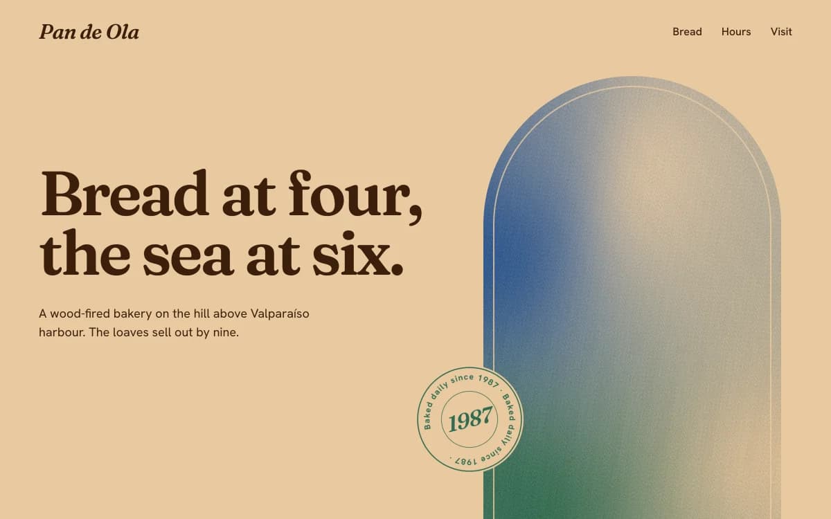
The specimen, for a fictional wood-fired bakery above a harbour, shows the idea in one screen: "Bread at four, the sea at six." A big serif statement, two lines of plain information, a slow gradient in an arched window and a round stamp with the year the oven was built.
Where it comes from
Analog Warmth draws on the printed ephemera of small businesses: letterpress menus, paper bags, hand-stamped labels, recipe cards, the signwriting on a shopfront. It also borrows from the soft serifs of the early twentieth century, faces like Windsor, Souvenir and Cooper, which were made for advertising and still feel friendly.
Fraunces, the display face here, was designed in that spirit: an old-style "soft serif" with optical sizes that get wonkier and more characterful as the type gets larger.
What defines it
| Element | The Analog Warmth choice | Why |
|---|---|---|
| Statements | Large serif sentences, written like a person talks | Warmth is in the voice as much as the colour |
| Ground | Sand, mustard, pistachio: never pure white | White feels like a screen; tinted paper feels like a thing |
| Photography | Portrait crops in uneven grids | Real people and places, not stock |
| Information | Menus, hours and schedules typeset like print | The practical bits deserve care too |
| Texture | Paper and grain | The page has a surface |
| Motion | Gentle line reveals, slow gradients, no hard cuts | Calm, like a morning |
Palettes
| Palette | Ground | Ink | Accent | Character |
|---|---|---|---|---|
| Dune | #E8C9A0 | #3A1F0B | #1E4D8C | Sand with burnt-umber ink; deep sky and sage as accents |
| Mustard ink | #E2B13C | #1E1A12 | #2A1FD6 | A 1970s paperback cover, with ultramarine for the hit |
| Pistachio plum | #D4E2BE | #2E1433 | #8E2C6E | A patisserie counter, with honey for small highlights |
Type
- Display: Fraunces. Soft, wonky optical sizes with real presence at weight 800 and above, gentle at smaller sizes. Its italics are lovely for one emphasised word.
- Text: Hanken Grotesk. A clear, slightly geometric sans that keeps hours, prices and addresses easy to read.
Motion and depth
Motion is unhurried: lines of text reveal gently, images unmask slowly, and a grain gradient drifts behind key statements at walking pace. Theme changes between sections are subtle, like light moving across a room.
Depth, when it appears, is soft: a grainy mesh gradient behind an arch, or photographs that resolve from a coarse print-like mosaic as they scroll into view. No hard 3D objects, no chrome.
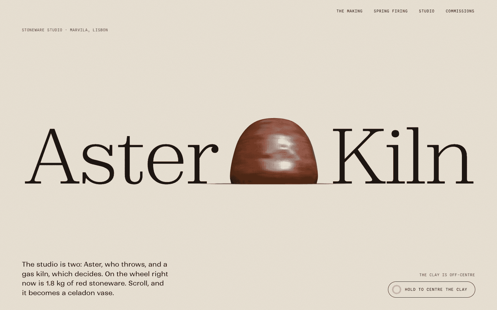
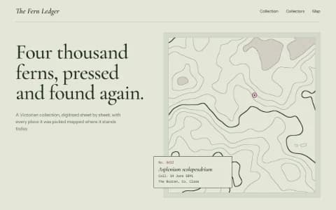
The ceramics studio in the community is a close cousin: a raw-clay ground, a serif wordmark, and a page that warms through the day as Lisbon light crosses a finished vase.
A typical page, section by section
Every site is designed for its own idea, so treat this as a sketch, not a template. A page in this style often runs like this:
- The statement hero. A big serif sentence that says what the place is, with the year or the hours in a stamp.
- The story, told in a few short chapters with photographs of the people and the place.
- The menu or the list, typeset like a printed card with prices aligned.
- The team, in uneven portrait crops with first names and what they do.
- A quote, if you have a real one from a real person, set large and hung in the margin.
- Contact as a letter: the address, the hours, how to book, written the way you would say it.
Who it suits
| A strong fit | A poor fit |
|---|---|
| Bakeries, cafés and restaurants | Tech products that need to feel precise |
| Makers, potters, woodworkers, small farms | Fashion brands selling sharpness |
| Bookshops, wine bars, family businesses | Event sites that need to feel loud |
| Places with a history and an address | Anything where speed is the selling point |
More on these in the use case for brand websites.
How it goes wrong
- Fake vintage. Distressed textures, coffee-ring stains and fake tape. Warmth comes from colour, type and real photographs, not props.
- Twee copy. "Lovingly handcrafted with passion" says nothing. "Bread at four" says everything.
- Hiding the practical. Hours, address, menu and booking are the most-visited parts of a café's site. They get the most care, not the least.
- Low contrast on tinted grounds. Sand and mustard need dark inks. Every pairing is checked for readability.
- Heavy textures. A paper texture should cost almost nothing to load. Words first, texture after.
What to prepare
Warmth comes from specifics, so the more real material you bring, the better the site:
- Photographs of the place and the people, even taken on a phone. A slightly imperfect real photograph beats a perfect stock one every time.
- The practical facts: hours, address, how to book or order, and what changes daily or weekly.
- The menu or product list, with prices. It will be typeset like a printed card, not a table.
- One line of story: the year the oven was built, who started it, why here. One true detail does more than a paragraph of adjectives.
Making it yours
- "A wood-fired bakery above a harbour. The loaves sell out by nine. Hours and what's baking today should be obvious."
- "A family wine bar open since 1987. The list changes weekly. People should want to book a table."
- "A potter who sells twice a year. The next firing date is the most important thing on the page."
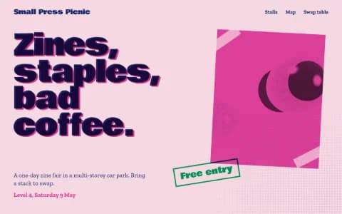
For a print look with more punch, see Riso Zine. For the scholarly side of paper, Botanical Archive. For warmth with more restraint, Quiet Luxury. Or describe your place to the AI website builder and let it propose the treatment.