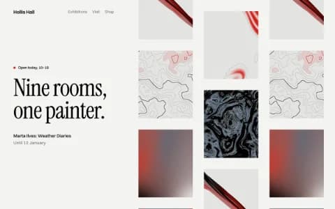
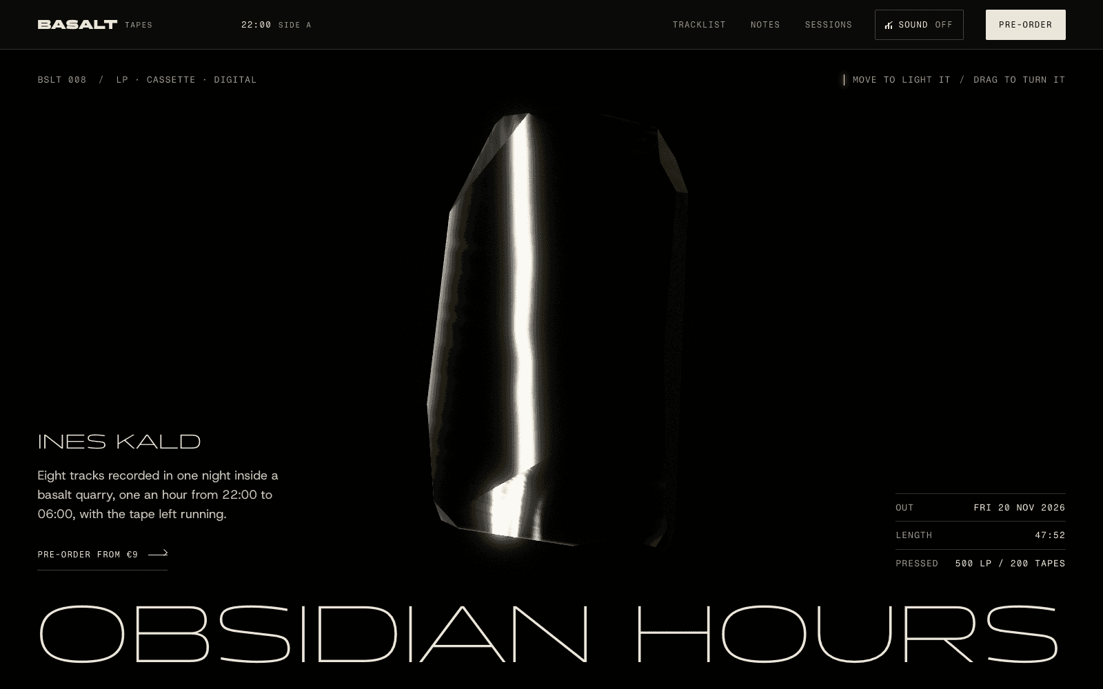
A photography portfolio website where the pictures lead
How to sequence, size, load and frame photographs on the web so the site serves the work, and how Laarpi builds a photography portfolio around your images.
A photography portfolio website has a simple brief and a hard one at the same time. Simple, because the pictures should do the talking. Hard, because the web is full of ways to make pictures worse: square-cropped thumbnails, compressed files, slideshows that hide the sequence, and backgrounds chosen by a theme instead of by the work.
This page is about getting that right: how to sequence a portfolio, how to show and load images without damaging them, how to choose a frame that fits your photographs, and how Laarpi builds a photography site around your images.
Edit before you design
The most important decision on a photographer's website isn't a design decision. It's the edit.
- Show series, not everything. A client looking for a food photographer doesn't need your wedding work on the same page. Separate bodies of work into series with their own pages.
- Sequence like a book. Open with a picture that states the series, vary scale and rhythm, and end on one that stays with people. A sequence is an argument; a grid sorted by date isn't.
- Cut harder than feels comfortable. Twelve to twenty strong frames per series beat a hundred decent ones. Reviewers remember your weakest image.
- Write one paragraph per series. Where, when, why. Captions with the place and year add context without getting in the way.
Show the images without damaging them
Most photography templates make the same mistakes. Here is how to avoid them.
| Common mistake | What it does to the work | Better |
|---|---|---|
| Square thumbnails | Crops every composition you made on purpose | A grid that keeps each image's real aspect ratio |
| One huge JPEG for every screen | Slow on phones, so people leave before it loads | Several widths in AVIF and WebP, chosen by the browser |
| Lazy-loading the first image | The hero appears last, and the page feels broken | Load the first image eagerly and the rest as you scroll |
| Autoplay slideshows | Visitors lose control of pace and sequence | Scroll sequences or a lightbox the visitor drives |
| Heavy watermarks | Spoils the image for the people you want to impress | Web-sized files and a credit line |
| Stripped colour on export | Skin and skies shift | Export in sRGB, check on more than one screen |
A note on metadata: if your files carry GPS coordinates, strip them before publishing, especially for portraits and home shoots.
Choosing a frame for your photographs
The site around the pictures should be designed for them. Four directions that suit different kinds of photography:
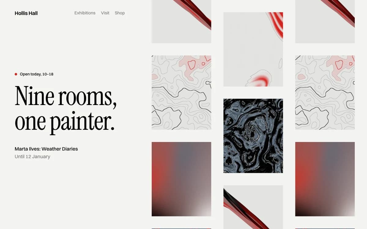
Gallery White Cube is the white wall: lots of air, quiet type, the work hung with space around it. Right for fine-art, still life, architecture and anything with subtle tones. The risk is anonymity, so the type and the hang have to carry the identity.
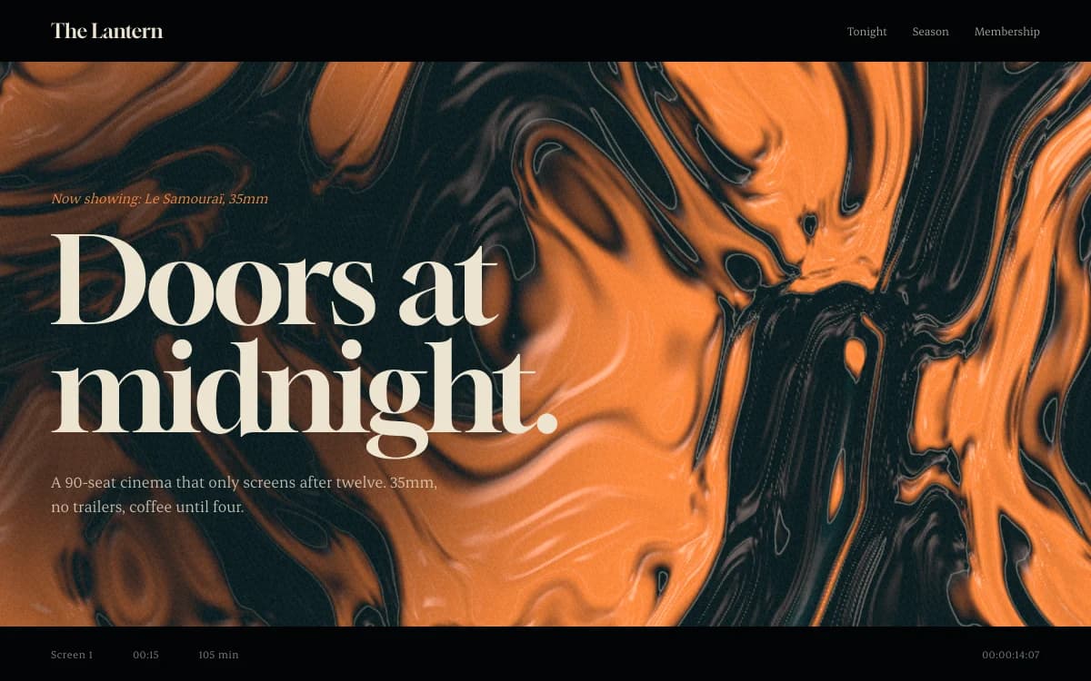
Cinematic Noir is graded like a film still: deep grounds, a single warm light, sharp serif titles, scenes that unfold as you scroll. Right for night work, film stills, music and moody portraiture. Dark grounds make pictures glow, but they also make them look brighter and more saturated than in print, so check your edit against it.
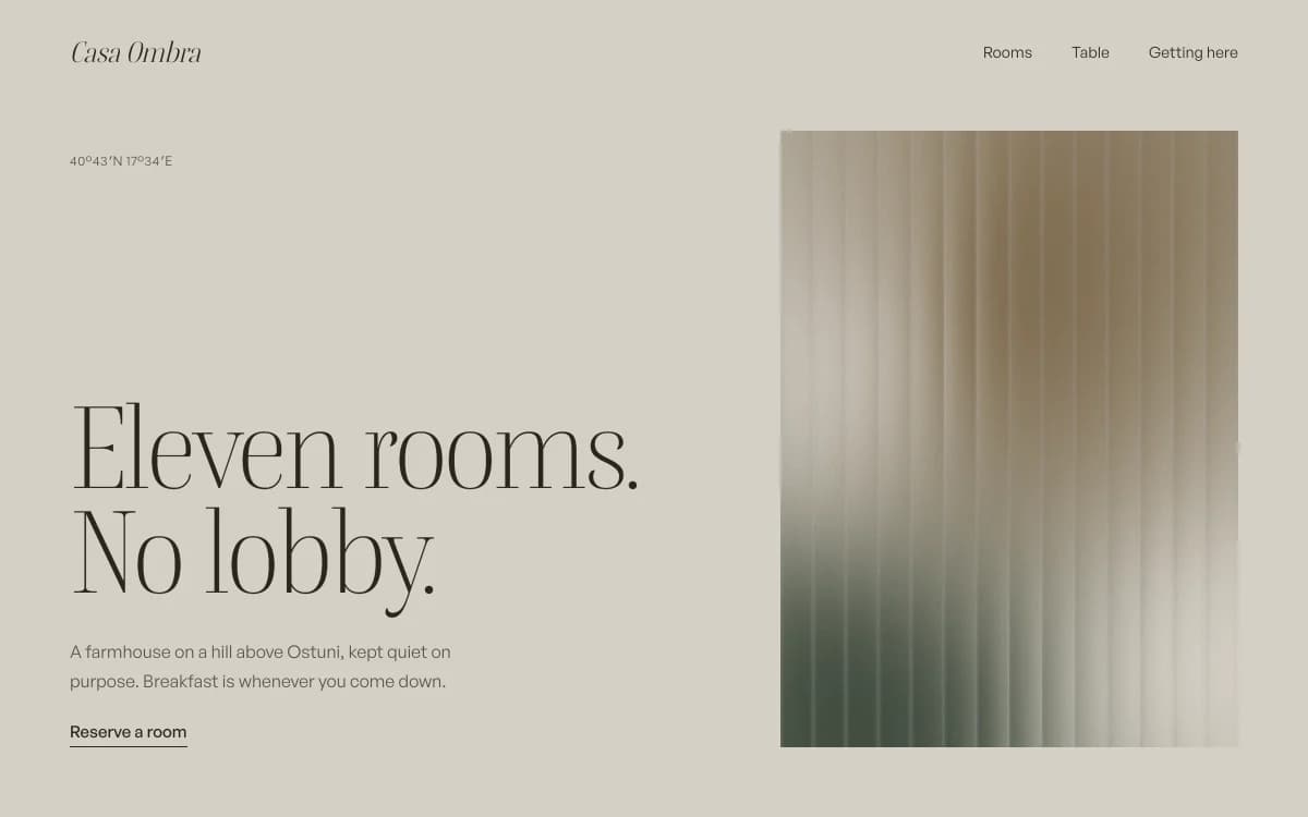
Quiet Luxury is stone, camel and a sharp serif. Nothing shouts. Right for interiors, hospitality and wedding photographers working at the top of the market, where the site needs to feel as calm as the pictures.
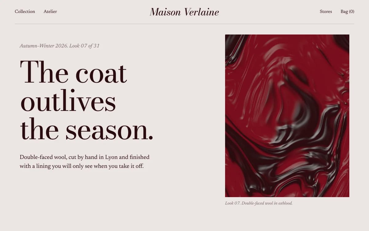
Editorial Luxe is the magazine spread: tall portrait crops, captions set off-axis, big type that overlaps images. Right for fashion and editorial photographers whose work lives in print.
Light as a subject
Photographers work with light, so a photography site can too, with restraint. Two examples from showcase sites made by the Laarpi team with Laarpi's library and process show what that can look like.
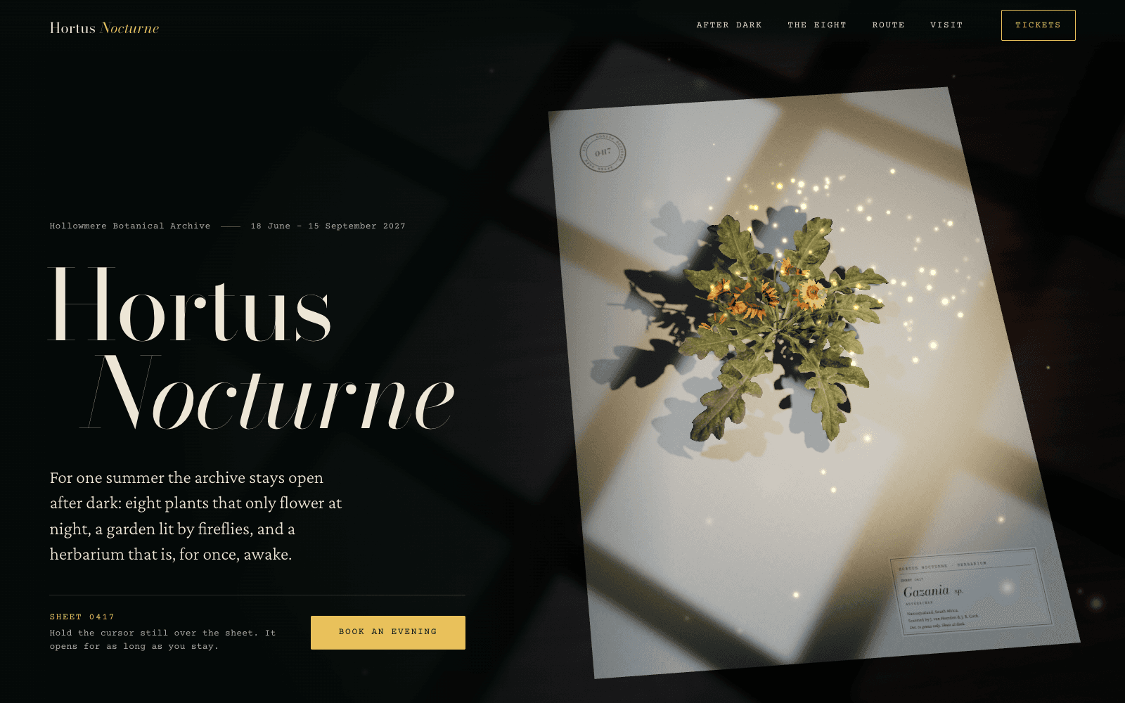
In Hortus Nocturne, a showcase site for a night-garden exhibition, colour only returns to a photoscanned flower where the light of gathering fireflies falls on it. The rest of the page stays in moonlight. It's a reminder that how an image is revealed can be part of what it means.
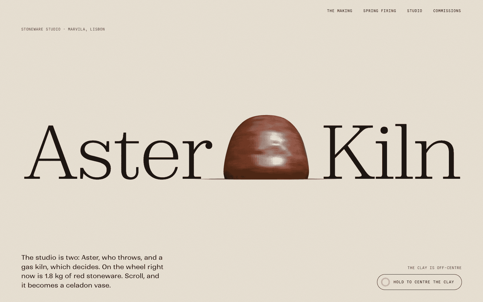
In Aster & Kiln, a showcase site for an imagined ceramics studio, one section sweeps the light of a Lisbon day across a finished vase, from morning to evening, while the page warms and the shadow swings. For a photographer, the same idea could show how one place changes across a day.
Both effects are built in real-time 3D, and both are slow and specific. Neither would survive being repeated in every section. For most photography sites the right amount of motion is very little: a considered transition into a series, a lightbox that opens without a jolt, and a still version for visitors who ask their system to reduce motion.
How Laarpi builds a photography portfolio
Describe your work and who you want to reach, attach your best images, and press Start building. Today, attached images guide the design as references; placing your own photographs on the site is in development in the private beta.
It asks only what changes the site. For a photographer that might be: "Should series open as long scroll sequences or as an index of covers?" or "Are these for agencies commissioning editorial, or couples booking a wedding?" The questions come as cards in the chat, with real palettes and type specimens to pick from.
It writes a plan you can edit, including the ground colour and why it suits your pictures, before any code is written.
It builds real code and checks its own work. It screenshots the site, checks the layout at six widths from 1920 down to 390 pixels, and has a separate art director score it on eight criteria, including composition, mobile and craft. On a Finish, it revises at least twice. For photography that means looking hard at the things templates get wrong: crops, sequence, how images load on a phone.
You direct it. Click a picture and say "this one opens the series" or "less space between these two". Only that part changes, and every version is kept.
It ships. Publish to a laarpi.site address, or your own domain on paid plans. Enquiry forms save to your own Supabase project, and digital downloads can sell through your own Polar account.
Making a photographer's website easy to find
Photography is one of the most local and most visual searches on the web. A few things that matter:
- Say where you work in plain text, on the page, not only inside an image. "Wedding and portrait photographer in Porto" is what people type.
- Write real alt text. Describe the picture for someone who can't see it: "Two fishermen hauling nets at dawn on Matosinhos beach", not "IMG_4412".
- Give each series its own page and title, so each can be found on its own.
- Keep it fast. Image weight is where photography sites usually lose speed. Our guide to website performance covers loading order and budgets in detail.
Laarpi builds every site with a meta description, a logical heading structure, alt text on every image and a reduced-motion version, and checks for them before publishing.
Selling from a photography site
Be clear about what you're selling before picking a checkout:
- Digital files (presets, high-resolution downloads, licences): sell through your own Polar account, wired to your buttons by Laarpi. See website payments.
- Physical prints and books: Polar doesn't sell physical goods, so link "Buy print" buttons to your print lab's or shop's checkout. The site can still present the prints beautifully.
- Commissions and shoots: an enquiry form that asks the right questions (date, location, type of shoot) beats a price list for most photographers.
Photography portfolio website checklist
- One line in the first screen saying what you photograph and where
- Series, not everything: 12 to 20 images each, sequenced on purpose
- Every image at its real aspect ratio, never cropped to a square
- Files exported in sRGB, at web sizes, with GPS data stripped
- The first image loaded straight away, the rest as you scroll
- Alt text that describes each picture
- A clear enquiry route: a form or an email address
- Your own domain once you're sending the link to clients
What Laarpi doesn't do for photographers
Laarpi builds a designed public portfolio in real code. It doesn't include client proofing, gallery delivery or print fulfilment, and you shouldn't pick it for those. If your main need is delivering hundreds of client images a week, use a proofing platform and link to it. If your need is a portfolio that looks like your photographs rather than like a theme, start here.
For other kinds of portfolio see the general portfolio website page, and for writing about your work, our guide to a portfolio that gets you hired.