Riso Zine: a website that looks printed, and proud of it
A style for zine fairs, bookshops, small labels and community events. How risograph printing translates to the screen, why overprinting is the whole trick, and how to avoid a site that looks like a filter.
Palette and type
Palette
- Ground#F6D8E2
- Surface#E7CCDA
- Ink#1C2A6B
- Muted#595B8C
- Accent#DB3E97
- Accent 2#00A95C
- Line#CAB5CA
Riso pink
Built from real risograph drum colours: fluorescent pink paper, Federal Blue as ink, green as the second drum. Looks printed, not rendered.
- Ground#E2B13C
- Surface#D4A639
- Ink#1E1A12
- Muted#53431D
- Accent#2A1FD6
- Accent 2#F7F1E3
- Line#BB9334
Mustard ink
Mustard ground and a warm black ink — a 70s paperback cover; ultramarine for the hit, cream for paper-white moments.
- Ground#E5E3DC
- Surface#D7D5CE
- Ink#1A1A18
- Muted#61605D
- Accent#D80700
- Accent 2#00599C
- Line#BCBBB5
Newsprint red
Grey newsprint, press-black ink, masthead red and a wire-service blue. Reads like a paper with something to say.
Type
Riso Zine
Bowlby One
Self-published and proud: risograph colours, halftone dots, heavy display type and slightly off registration.
Zilla Slab
- Layout
- Poster frames, rotated bands, collaged images, programme listings; mixes centred and flush-left on purpose.
- Motion
- Pixel reveals on images, displacement on hover, marquees; halftone texture over everything.
Try it with a prompt
“A zine fair in a car park. Stall map, swap table, coffee. Free entry.”
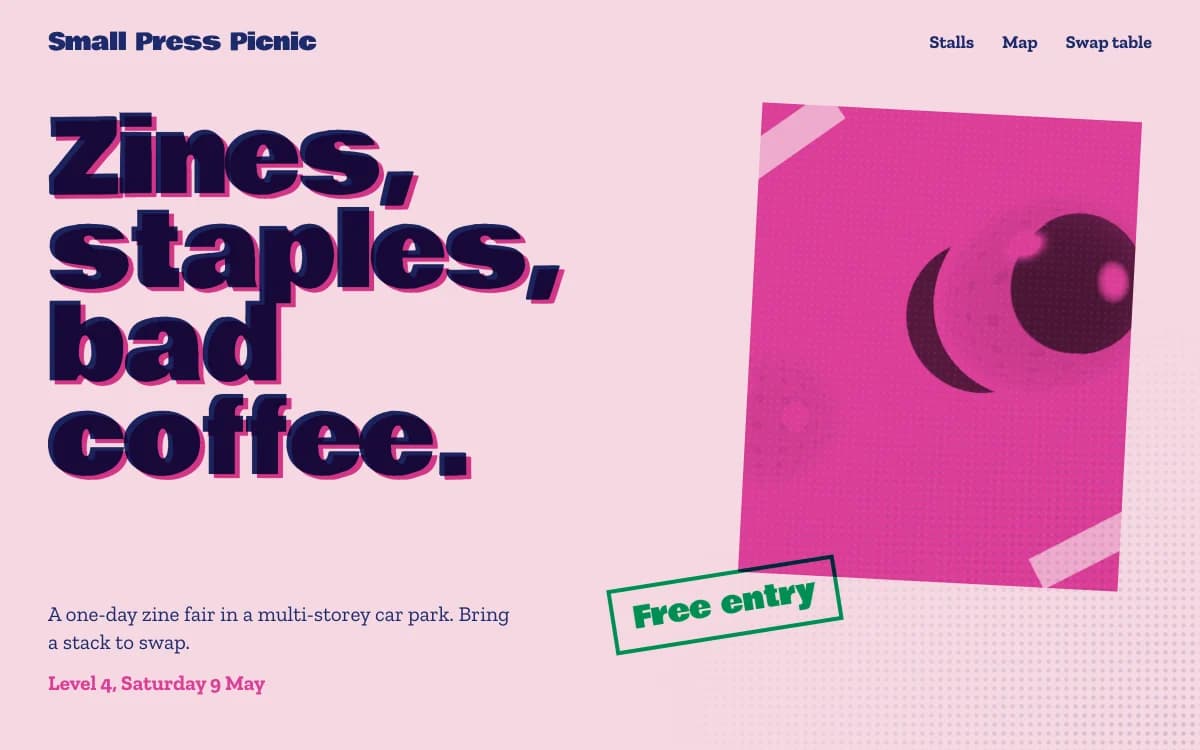
Start building in Riso ZineRiso Zine is the website as a self-published print. Fluorescent pink paper and blue ink. Halftone dots. Heavy poster letters. Images collaged on top of each other. Bands rotated a few degrees. Colours that overprint where they meet, with registration slightly off, the way real riso prints are.
It looks made by people who care, on a machine in the back room.
The specimen, for a fictional zine fair in a multi-storey car park, stacks "Zines, staples, bad coffee." in ultra-heavy blue type on pink, a magenta print collaged off-axis, and a tilted green "Free entry" sticker. The practical line underneath: level 4, Saturday 9 May.
Where it comes from
The risograph is a stencil duplicator made by the Japanese company Riso Kagaku, introduced in the 1980s for fast, cheap office printing. Artists and small publishers adopted it because each drum prints one bright, translucent ink. Layering colours one pass at a time produces rich overprints, and the layers never line up perfectly.
Zines are older: small, self-published magazines made by fans, punks and artists, photocopied and stapled by hand. Riso Zine combines the two: the colour of the risograph and the cut-and-paste spirit of the zine.
What defines it
| Element | The Riso Zine choice | Why |
|---|---|---|
| Colour | Real riso drum colours that overprint | It looks printed, not rendered |
| Texture | Halftone dots and grain | Ink on paper |
| Type | Ultra-heavy poster display, a slab with typewriter flavour | Loud headlines, honest listings |
| Images | Collaged, off-axis, colour-separated | Cut and paste |
| Layout | Poster frames, rotated bands, centred and flush-left mixed on purpose | Hand-assembled, not templated |
| Listings | Programmes and schedules | Every zine needs a contents page |
Palettes
| Palette | Ground | Ink | Accent | Character |
|---|---|---|---|---|
| Riso pink | #F6D8E2 | #1C2A6B | #DB3E97 | Fluorescent pink paper, Federal Blue ink, green as the second drum |
| Mustard ink | #E2B13C | #1E1A12 | #2A1FD6 | A 1970s paperback cover, ultramarine for the hit, cream for paper-white |
| Newsprint red | #E5E3DC | #1A1A18 | #D80700 | Grey newsprint, press black, masthead red and wire-service blue |
The riso pink palette is built from real risograph drum colours, which is why it reads as printed rather than designed on screen.
Type
- Display: Bowlby One. An ultra-heavy display face for posters and stickers.
- Text: Zilla Slab. A slab with a typewriter accent, strong for listings, labels and specs.
Motion and depth
Motion is handmade, not slick. Images resolve as they enter: a coarse mosaic posterised into the palette, dragged into streaks, then stepping through finer grids to the full picture, like a print coming off the drum. Photographs displace and split their colour under the cursor, as if the layers had shifted. Marquee bands run the programme across the page.
A halftone texture sits over everything, so every colour looks like ink.
How overprinting works on screen
On a risograph, inks are translucent, so where pink prints over blue you get a third colour, a deep purple, for free. On screen, the same effect comes from multiply blending: each colour layer darkens what is beneath it instead of covering it, exactly like ink.
That one rule explains most of the look:
- two drums give you three colours, because of the overlap;
- photographs separated into two inks become duotones with real depth;
- a few pixels of offset between layers produce the slight misregistration of a real print.
It also explains the limit. Every extra ink multiplies the overlaps, which is why a convincing riso page keeps to two or three.
A typical page, section by section
Every site is designed for its own idea, so treat this as a sketch, not a template. A page in this style often runs like this:
- The poster frame. The name in ultra-heavy type, a collaged image, a sticker with the one fact people need.
- A rotated marquee of names, titles or stalls.
- The collage: prints, photographs and scans layered at angles.
- A hung quote, if a real person said something worth printing.
- The programme: a schedule or list set like the contents page of a zine.
Then the essentials: where, when, how much and how to get there, in plain rows.
Who it suits
| A strong fit | A poor fit |
|---|---|
| Zine fairs, book fairs and community events | Corporate and enterprise brands |
| Independent bookshops and small publishers | Luxury and quiet hospitality |
| Small labels and musicians | Technical products sold on precision |
| Print studios, cafés, art-school shows | Healthcare and finance |
More on these in the use cases for event websites and music artist websites.
How it goes wrong
- A filter, not a print. A halftone overlay on a generic layout does not make a zine. The colour logic, the overprints and the collage do.
- Fake distress. Coffee stains, torn edges and tape. Riso is clean ink with honest imperfection.
- Misregistration on text. Offset layers look great on images and headlines, and terrible on paragraphs. Body text stays sharp.
- Too many colours. A riso print has two or three drums. So does the page.
- Contrast on pink. Pale pink ground needs a deep blue ink. Every pairing is checked for readability.
What to prepare
- The programme or the list: stalls, artists, issues, titles. Zine sites live on their listings.
- Your own scans or photographs. Real prints and real people make the collage.
- The essentials: where, when, how much, how to get there.
Making it yours
- "A zine fair in a car park. Stall map, swap table, coffee. Free entry."
- "An independent bookshop. New arrivals as a printed list, events as a programme."
- "A tape label releasing one cassette a month. Each release gets its own two-colour cover."
Seen a print-style site in the community you love? Remix it and make it yours. For warm print without the noise, see Analog Warmth. For the club-flyer version, Acid Rave. For bright and bouncy, Playful Toybox.