Acid Rave: a website with flyer energy
A style for club nights, festivals and labels that should feel like a night out. How to get flyer energy on screen while keeping dates, lineups and tickets easy to find, and the safety rules for loud motion.
Palette and type
Palette
- Ground#C8F31D
- Surface#B8E00F
- Ink#1A0533
- Muted#60642A
- Accent#2B00FF
- Accent 2#FF2E88
- Line#A5C321
Acid rave
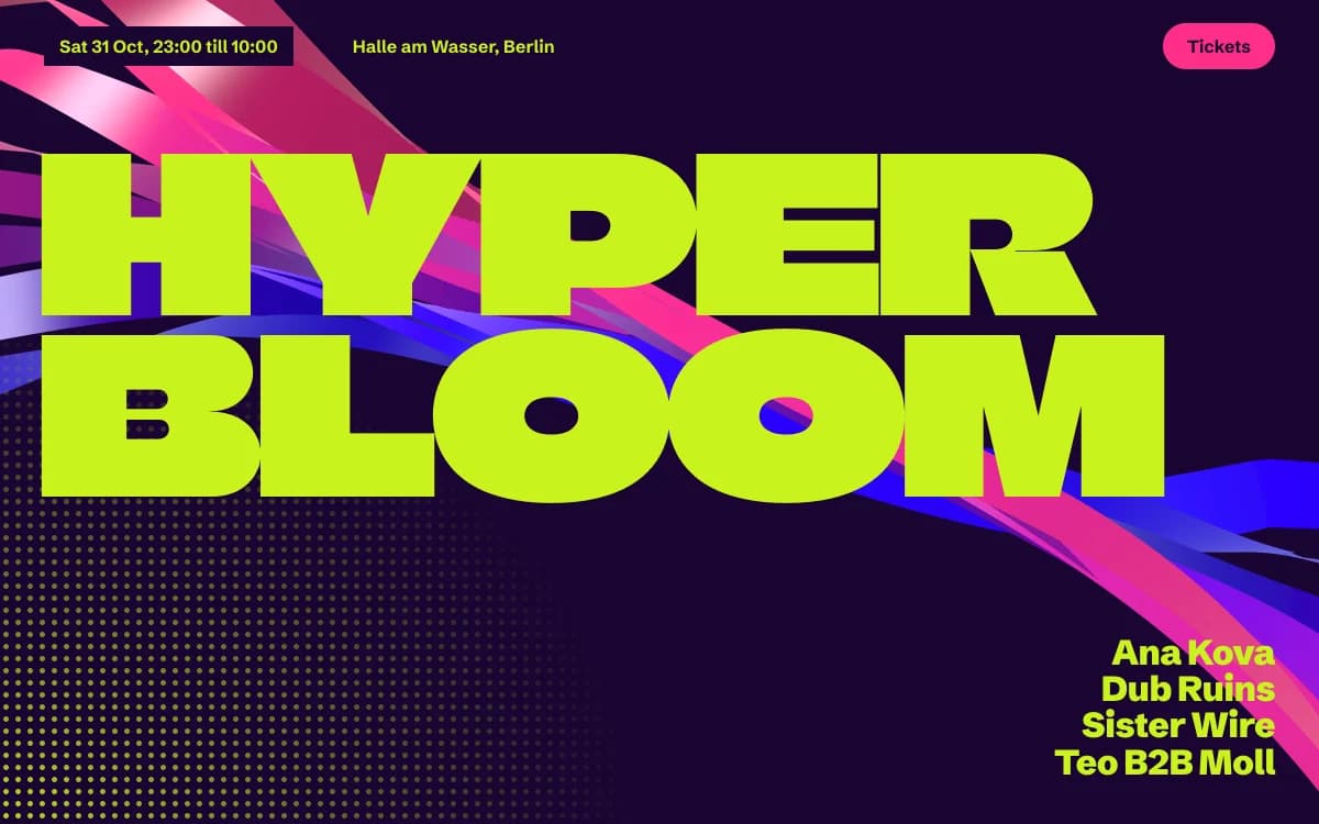
Lime as the ground, not the accent: the page itself is the flyer. Deep violet ink keeps text crisp; electric blue and pink fight for attention on purpose.
- Ground#0F2A1D
- Surface#223C2E
- Ink#E6F3DE
- Muted#819583
- Accent#FF6FB5
- Accent 2#D8F15A
- Line#435A4B
Forest neon
Night-forest green ground with a pale moss ink; neon pink and lichen yellow like festival lights strung in trees.
- Ground#160830
- Surface#2A1C43
- Ink#F2E9FF
- Muted#867B9A
- Accent#FF9E3D
- Accent 2#9C7BFF
- Line#4B3E62
Ultraviolet ember
A violet-black night with a lavender-white ink; ember orange is the warmth in the room, a soft periwinkle the echo.
Type
Acid Rave
Climate Crisis
Flyer energy: lime grounds, violet ink, melting type and ribbons of light. For clubs, festivals and labels.
Schibsted Grotesk
- Layout
- Stacked bands of colour, rotated marquees, timetable programmes, tickets as price columns.
- Motion
- Velocity marquees, particle wordmark, ribbon-flow backgrounds, ink-trail cursor, accent theme sections.
Try it with a prompt
“An all-nighter in a club by the river. Five DJs, doors at eleven. Tickets in three tiers.”
Start building in Acid RaveAcid Rave is a flyer you can scroll. Lime green as the ground, not the accent. Deep violet ink. Display type that melts. Ribbons of light sweeping through. A rotated marquee of the lineup. Tickets laid out as price columns.
It is loud on purpose. The craft is in keeping it usable.
The specimen, for a fictional all-nighter in a Berlin club, puts the night's name in giant lime letters over a sweep of violet and pink ribbons, the lineup stacked in the corner, and a single round Tickets button at the top right.
Where it comes from
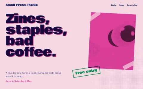
Acid house arrived in the late 1980s, and with it a graphic language: photocopied flyers, smiley faces, fluorescent inks, type stretched and warped by hand. Every party had a flyer, and every flyer competed for attention on a wall of others.
In the late 2010s a new generation of designers revived the look as "acid graphics": chrome, liquid forms, warped type and clashing colours, now drawn in 3D software. Acid Rave takes that energy and builds it with real-time ribbons and type that reacts to the visitor.
What defines it
| Element | The Acid Rave choice | Why |
|---|---|---|
| Ground | Lime, night-forest green or violet-black | The page is the flyer |
| Display type | A face that melts under a variable axis | Urgency you can see |
| Layout | Stacked bands of colour, rotated marquees | Flyer density, not corporate air |
| Information | Timetables and programmes in clear rows | Everyone needs to know who plays when |
| Tickets | Price columns with one obvious action | Selling is the job |
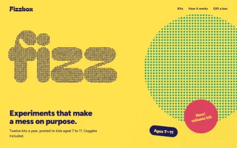
| Texture | Halftone dots | Printed, photocopied, physical |
Palettes
| Palette | Ground | Ink | Accent | Character |
|---|---|---|---|---|
| Acid rave | #C8F31D | #1A0533 | #2B00FF | Lime ground and violet ink; electric blue and pink fight for attention |
| Forest neon | #0F2A1D | #E6F3DE | #FF6FB5 | Festival lights strung in trees |
| Ultraviolet ember | #160830 | #F2E9FF | #FF9E3D | Violet-black with ember orange: the warmth in the room |
Type
- Display: Climate Crisis. A variable typeface whose "year" axis makes the letters melt, designed to show the decline of Arctic sea ice. Used here for its urgency, it is a reminder that a type axis can carry meaning.
- Text: Schibsted Grotesk. A dense, confident grotesk born in a media house, very legible in timetables and ticket rows.
Motion and depth
- Ribbon flow: silk ribbons swelling through the frame, satin on the front and shadowed on the back, parting around the cursor.
- Particle type: the night's name built from thousands of particles that swarm and settle.
- Velocity marquees: the lineup running across the page, faster as you scroll faster.
- Ink trail: the cursor leaves a trail of pigment that bleeds and fades.
- Theme flow: sections switch colour as you arrive, like walking from room to room.
All of it stops for visitors with reduced motion switched on, who get a composed still flyer. Nothing flashes more than three times a second, which matters in a style that loves strobes.
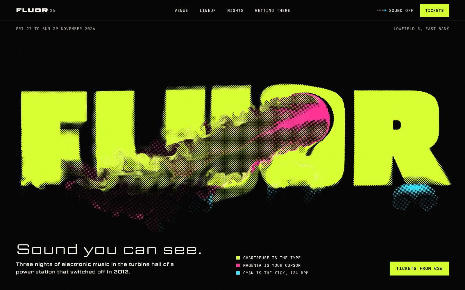
The festival site in the community runs on the same energy: its name printed in fluorescent ink you can stir, a kick drum that pushes the ink at 124 beats per minute, and each artist's name melting when you point at it.
A typical page, section by section
Every site is designed for its own idea, so treat this as a sketch, not a template. A page in this style often runs like this:
- The flyer hero. The name, huge and melting, with the date, the place and the Tickets button in reach.
- A rotated marquee running the lineup across the page.
- The timetable: who plays when, in clear rows, room by room.
- The plane of images, posters, artists or past nights, to drag through.
- Tickets as price columns, each tier with one button.
- The closing call on a fresh colour, with the essentials repeated for the people who scrolled straight down.
Who it suits
| A strong fit | A poor fit |
|---|---|
| Club nights, festivals and events | Professional services |
| DJs, producers and music artists | Healthcare, finance, public sector |
| Record labels and streetwear drops | Luxury that sells calm |
| Art-school shows, zines, radio stations | Audiences sensitive to busy screens |
More on these in the use cases for event websites and music artist websites.
How it goes wrong
- Strobing. Rapid flashing colour can trigger seizures. It is never worth it.
- Hiding the facts. If visitors cannot find the date, the venue and the ticket price in five seconds, the flyer failed.
- Unreadable layering. Type over ribbons over halftone, all at once. Layers are fine; legibility is not optional.
- The purple-to-blue gradient in disguise. Acid palettes clash on purpose with hard flat fields. A smooth violet-to-blue wash is the generated-site version.
- Invented hype. Fake "sold out" badges and countdowns that reset. Real scarcity only.
What to prepare
- The lineup, with set times if you have them. It drives the marquee and the timetable.
- Ticket types and prices. With website payments connected, each becomes a checkout button.
- Venue and travel details: address, doors, last entry, the nearest night bus.
- Artist photographs and logos, only ones you have the rights to use. If you have none, the type carries the flyer on its own.
Making it yours
- "An all-nighter in a club by the river. Five DJs, doors at eleven. Tickets in three tiers."
- "A record label's tenth birthday party. The logo should melt."
- "A streetwear drop for one weekend. Loud, and the sizes easy to find."
For type-first energy without the flyer, see Kinetic Type. For the print shop version, Riso Zine. For brightness without the night, Playful Toybox. And read accessible motion before you ask for more strobes.