Brand website
Brand sites built from the brand's own material, with craft shown rather than described: what the site has to do, a dissected example, the sections and the type.
A brand website has to make people feel the brand's craft through a screen that can't be touched. The way to do it is to show the craft itself, the material, the mechanism, the ritual, instead of describing it with adjectives. A watchmaker shows the finishing under a loupe. A ceramicist shows the clay. A perfumer shows the raw materials. The words then only need to name what people are already seeing.
This page covers what a brand website has to do, a dissected example, how to build from your own material, the sections, type and restraint for luxury and editorial brands, speed with heavy imagery, and how SI is built to make one. If your brand guide is the starting point, read a website from your brand guidelines alongside it.
What a brand website has to do
Three things, roughly in this order:
- Show what you make, properly. Large, well lit, in your own photographs or a faithful 3D model.
- Show how it's made, or why. The making, the material, the people. This is where a brand earns its price.
- Tell people where to get it. The range, the stores, the waiting list or the appointment.
What it shouldn't do is say "crafted", "timeless" or "passion" in the headline. Those words are what every brand says, so they carry no information. A site that shows the bevels on a watch bridge never needs the word "crafted".
Meridian M-01: storytelling with a mechanism
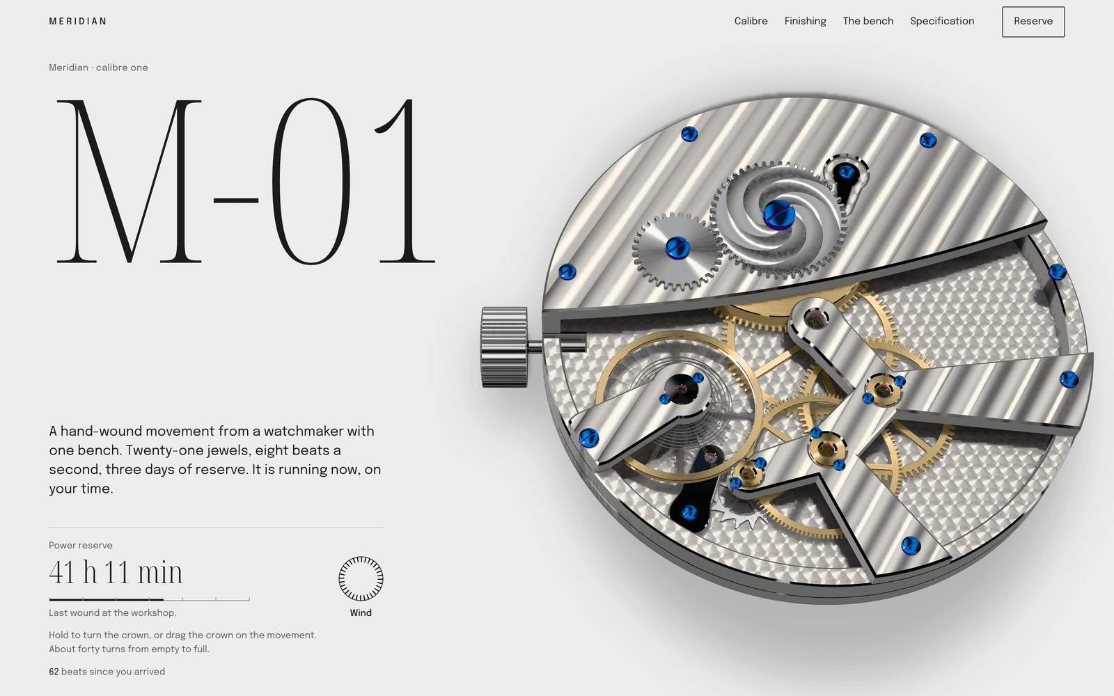
Meridian M-01 is a concept site made by the Laarpi team with Laarpi's library and process. The brand is invented: a one-bench watchmaker making eighteen watches of its first hand-wound calibre. It's a useful example because every part of the page is the brand's craft, made interactive.
The audience reads movements before dials: collectors of independent watchmaking and watchmakers who will zoom in to check the bevels. The brief's three goals were to reserve the eighteen pieces, make the finishing legible to someone who has never held a loupe, and prove the calibre is a coherent machine.
The metaphor is the watchmaker's bench: paper under north light, a loupe for a cursor, a crown you turn to store energy, a parts sheet where the calibre lies in service order.
| Section | What the visitor does | What it says about the brand |
|---|---|---|
| The bench | Winds the movement, which runs at their own local time | It's a working machine, and it's alive |
| The parts sheet | Scrolls; the calibre comes apart in service order, every part numbered | Nothing is hidden; this maker knows every part |
| The loupes | Watches five lenses cross the finishing; polished surfaces turn black to white | The finishing is real, and here's how to judge it |
| Reassembly | Scrolls to put it back; winds it; the balance starts | Competence |
| Reservation | Sees the specification, then a ledger of eighteen numbers and a deposit button | Scarcity, shown as a list, not claimed in a banner |
The restraint is the luxury. The interface is strictly paper, graphite and pencil greys, so every colour on screen comes from light in the render: the warm German silver, the gold of the wheels, the blue of heat-blued screws, the red of the rubies. The brief ruled out the usual luxury-watch look: black backgrounds, gold gradients, lens flares, invented press quotes and collector logos.
The type carries three peaks only: M-01, the beat count when the watch starts, and 18. Noto Serif Display at hairline weights reads like an engraver's line; Epilogue sets everything else.
You don't need a 3D watch movement to use the lesson. Ask what proves your craft to the person who knows most about it, and build the page around showing that.
Start from your own material
The strongest brand sites are built from the brand's own words and images, not from a builder's defaults. Placing your own files on the site is in development in the private beta; today, attached images guide the design as references. This is how SI is built to use each kind of material:
- The brand guide, logos and fonts. These become rules. Logos are placed as supplied and never redrawn; your fonts are self-hosted on the site.
- Photography. Placed faithfully: no crop unless you ask, no colour change, no generative edits.
- Copy. Product descriptions, the founder's story, the care guide. Used as written.
- The range. A spreadsheet or PDF of products, materials and prices, so the range section uses your numbers.
- Your current site, if you have one. Confirm it's yours and SI reads its pages and images as content.
SI, Laarpi's website agent, is automated software running on AI models from third-party providers. It reads all of this before writing the brief, and the brief names which material each key decision came from. Facts on the page, such as prices, dates, awards and quotes, must come from your material or your messages; a missing one is left as a visible placeholder. The full list of file types and what happens to each is on website from brand guidelines.
The sections
| Section | What goes in it | Notes |
|---|---|---|
| The object or idea | What you make, shown large, named in one sentence | Your best photograph or a faithful model, not a mood board |
| The making | Process, material, tools, place | The section that justifies the price. Show steps, not adjectives |
| The people | Who makes it, in their own words | Real names and photographs only, with their consent |
| The range | Collections or products, with materials and prices | Prices from your own price list |
| Care, sizing, provenance | The practical detail buyers of good things want | Often the most-read page after the home page |
| Where to buy | Stores, stockists, your online shop, appointments | Links out to the store you already run (see the FAQ) |
| Journal | Stories, launches, collaborations | Only if you'll keep writing it |
For a single hero product, the product launch page use case goes deeper on the sections that sell one object.
Type and restraint for luxury and editorial brands
Luxury on screen is mostly about what you leave out: fewer colours, fewer sizes, more space, slower motion. Two directions suit brands like these, as starting points the brief can adapt.
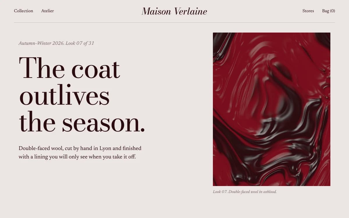
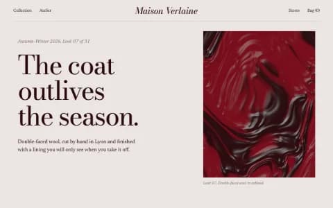
Editorial Luxe is a fashion-magazine spread on the web: Didone display type (Bodoni Moda), a literate text serif (Newsreader), quiet colour and a lot of air. Motion is slow line-mask reveals and mask reveals on images. It suits fashion houses, photographers and publishers who would rather be read than skimmed.
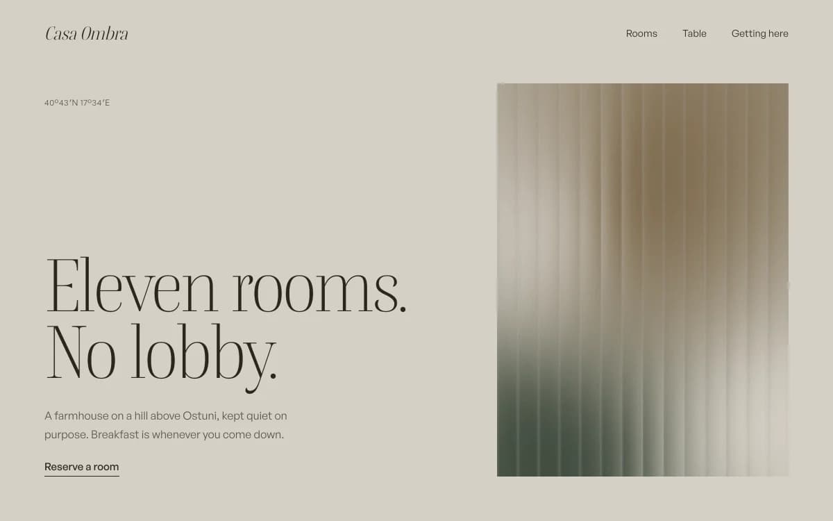
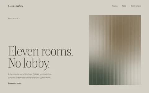
Quiet Luxury is stone, camel and a sharp serif (Boska, with General Sans for text), where nothing shouts and everything is placed. Motion is limited to slow fades and line reveals. It suits boutique hotels, makers and maisons whose customers don't want to be shouted at.
A few rules that hold in both:
- One typographic peak per screen. If everything is large, nothing is.
- Colour from the product. Let the photographs or the render carry colour; keep the interface neutral.
- Motion at the speed of the product. A watch page can move in escapement beats; a linen brand can barely move at all.
- Your own type, if you have it. A licensed brand face, uploaded, beats any direction's defaults.
Speed with heavy imagery
Brand sites are image-heavy by nature, so speed is a design decision, not a technical afterthought.
- Your photographs are resized, into web versions at up to four widths (640, 1280, 1920 and 2560 px, never above the original) and checked to look identical to the source before the smallest passing version is used.
- Text first. The name, the sentence and the navigation shouldn't wait for a 2560 px hero.
- Fewer, better images. Ten full-bleed photographs on one page is a choice. Three, chosen well, usually say more.
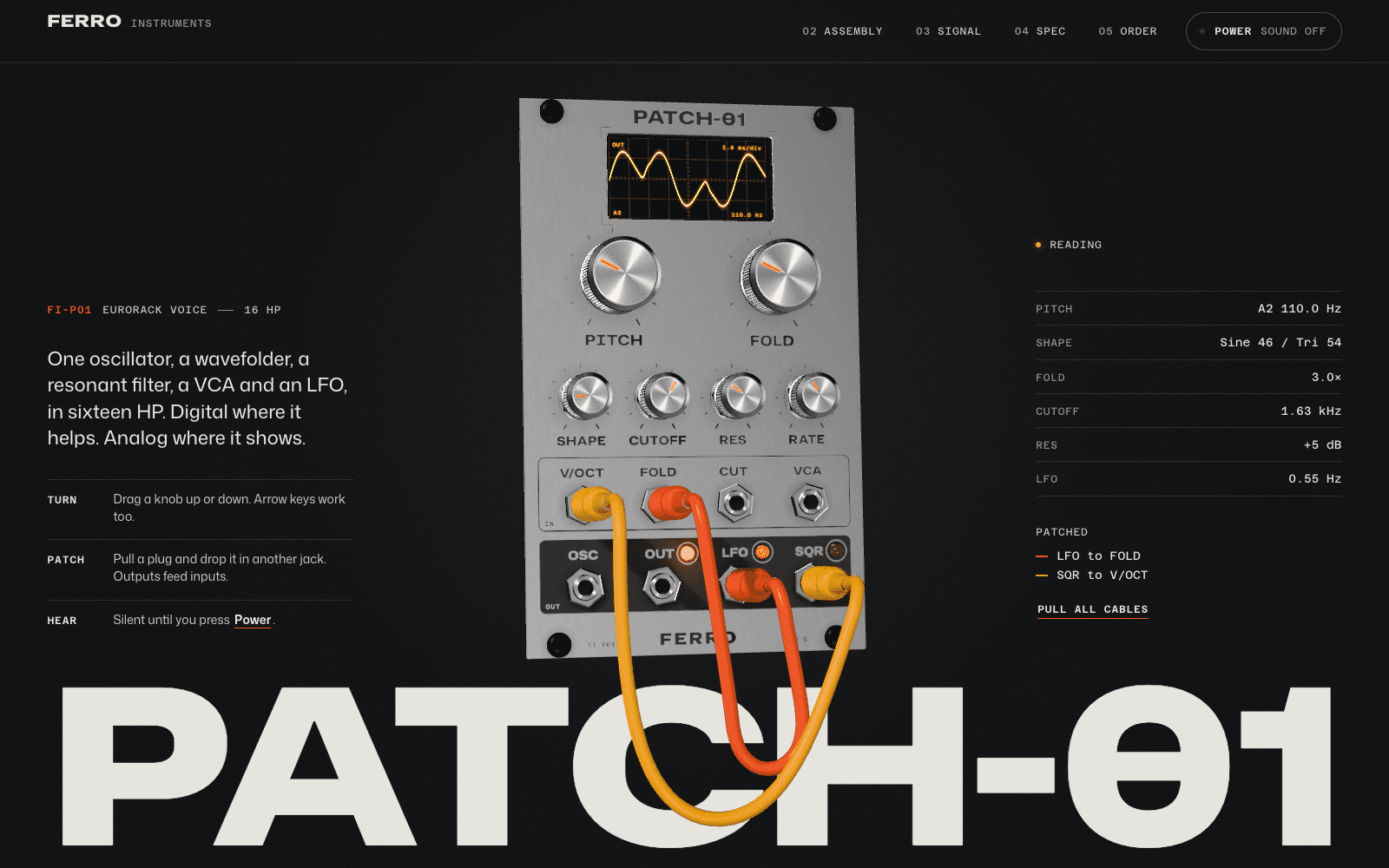
- 3D only where it proves something. Meridian needs it because the mechanism is the story. On our phone profile (slow 4G, CPU slowed four times, measured 6 October 2026) its loader appears at 0.9 s and the movement is fully drawn at 11.5 s. A brand whose story is texture and colour may be better served by photography alone.
Fast websites with 3D covers the trade-offs in detail.
How SI works on a brand website
Laarpi is in private beta, and this is the process SI is built to follow. Describe the brand, who it's for and what should happen when they arrive. Attach your guide, logos, fonts, photographs and copy (placing your own files on the site is in development), and press Start building. SI asks only the questions your material doesn't answer, such as "Is the site for buyers who know the craft, or for people discovering it?" It writes a brief you can edit, with the idea, the story beat by beat, the type and colour roles and where each came from, then builds the site in real code while you watch. A Draft gives you a fast first version; a Finish, on paid plans, runs every check, including layout at six widths, accessibility and reduced motion, until they pass. You direct it by pointing at a section or saying what to change, and publish to a laarpi.site address or your own domain on a paid plan. Pro is $25 a month.
Laarpi doesn't run a store, and Polar, which handles checkout on Laarpi sites, doesn't cover physical products. If you sell goods, keep your store and let the brand site send people to it. For a company launching its first product, see startup website.