A portfolio website that looks like your work, not a theme
What a portfolio website has to do in its first ten seconds, how to structure it, and how to give it a look that belongs to your practice instead of a template.
A portfolio website has one job: get the right person to open your best project and then get in touch. Everything else is decoration, and most portfolios carry far too much of it.
The other problem is quieter. Most portfolios are built on themes, so they share a skeleton: a name centred at the top, "Hi, I'm…", a grid of equal thumbnails, an about page, a contact link. The work inside might be extraordinary, but the frame says "same as everyone else". For anyone who designs, makes or directs things, the site itself is the first piece of work a reviewer sees.
This page covers what a portfolio website needs, how to structure it, how to choose a look that belongs to your practice, and how Laarpi builds one.
What the first ten seconds have to do
The person opening your portfolio is usually a hiring manager, a creative director, a client or a curator. They have other tabs open. In the first screen they need three answers:
- Who you are and what you do, in one plain sentence. "Type designer working on Arabic and Latin families" beats "Creative. Thinker. Maker."
- What your best work looks like, visible without scrolling, or one scroll away at most.
- What to do next, whether that's opening a project, emailing you or booking a call.
If the first screen spends its space on an animation with no work in it, you lose the reviewers who are skimming, which is most of them. Motion and 3D can earn their place, but only once the work is visible.
A structure that works
You don't need many pages. You need the right ones, each with a clear job.
| Page or section | Its job | What to avoid |
|---|---|---|
| Home | Say what you do; show 4–8 selected projects, strongest first | A wall of 30 equal thumbnails |
| Project pages | Show how you think: the problem, your role, the decisions, the result | Image dumps with no captions |
| Index (optional) | Keep older or smaller work findable | Mixing it into the selected work |
| About | Your practice, your background, who you've worked with (real names only) | A life story; invented "trusted by" logos |
| Contact | One clear way to reach you | Five social icons and no email |
A good rule: selected work on the home page, everything else in an index. Reviewers judge you by the weakest project they see, so curation is part of the craft.
Case studies people finish reading
A project page is where people decide whether to hire you. Write it for someone scanning:
- One line of context: client or brief, year, your role.
- The problem, in two or three sentences. What made it hard?
- The decisions you made, with the image that shows each one. Captions do a lot of work here.
- The result, with real outcomes only. If you don't have numbers, say what changed.
- Credits for collaborators. It reads as confidence, not modesty.
Our guide to building a portfolio that gets you hired goes deeper on case-study writing and on what reviewers look for by discipline.
Choosing a look that fits the work
The look of a portfolio should come from the work, not from what is fashionable this year. A few directions, and when each one fits:
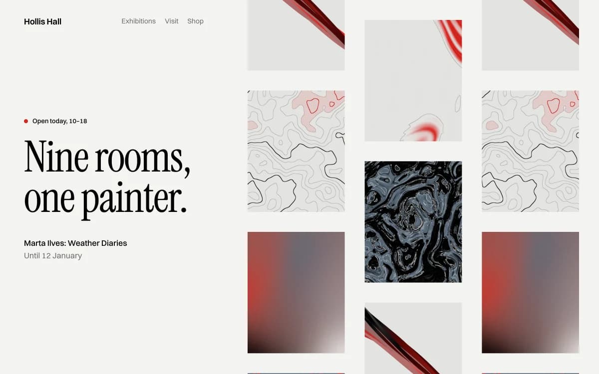
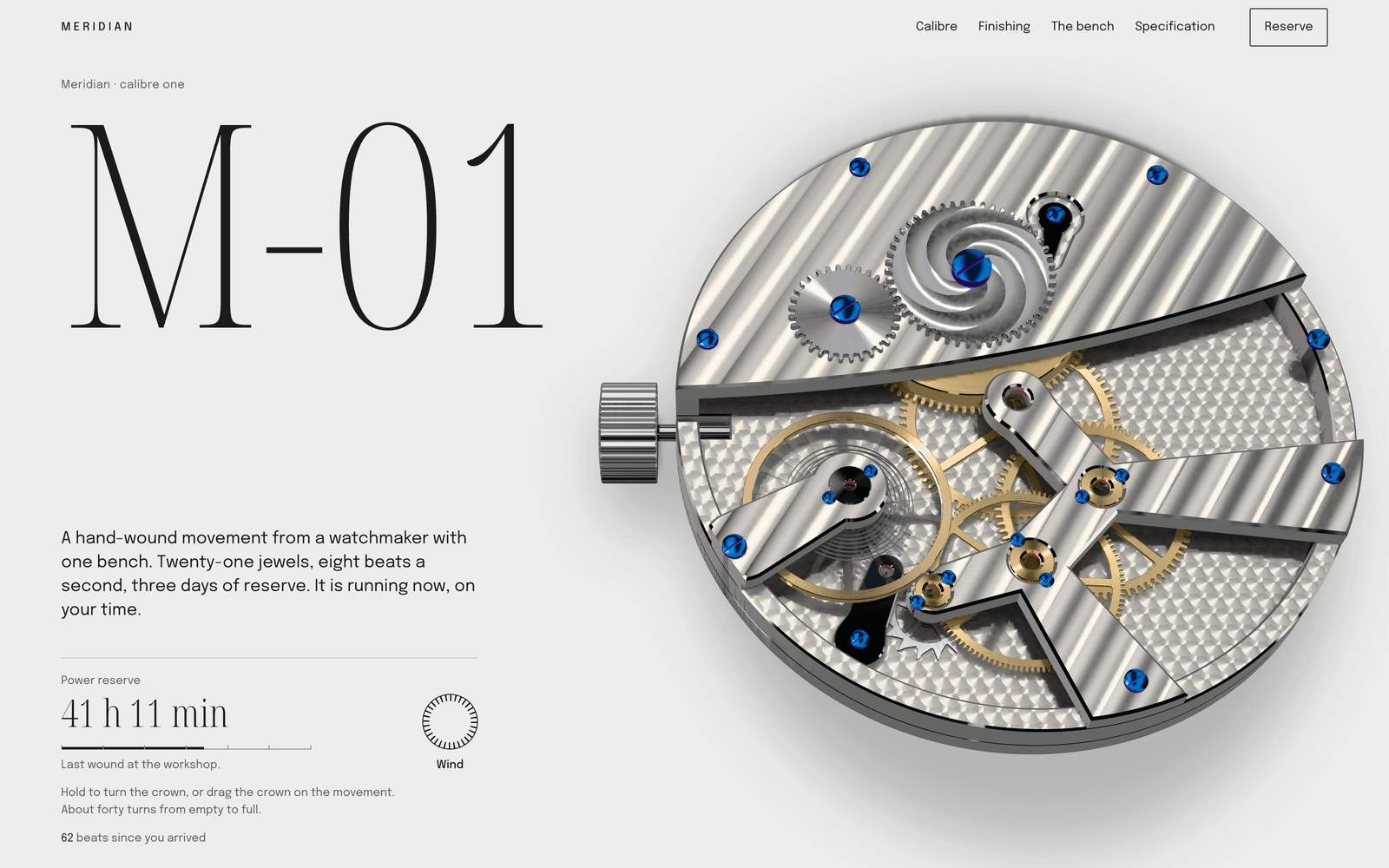
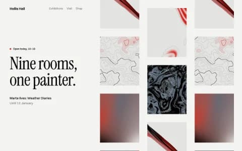
Gallery White Cube treats the site as a white wall and hangs the work on it. Restraint everywhere except the images. It fits illustrators, painters, photographers and product designers whose work is colourful or detailed enough to carry the page. It fails when the work is mostly text or process.
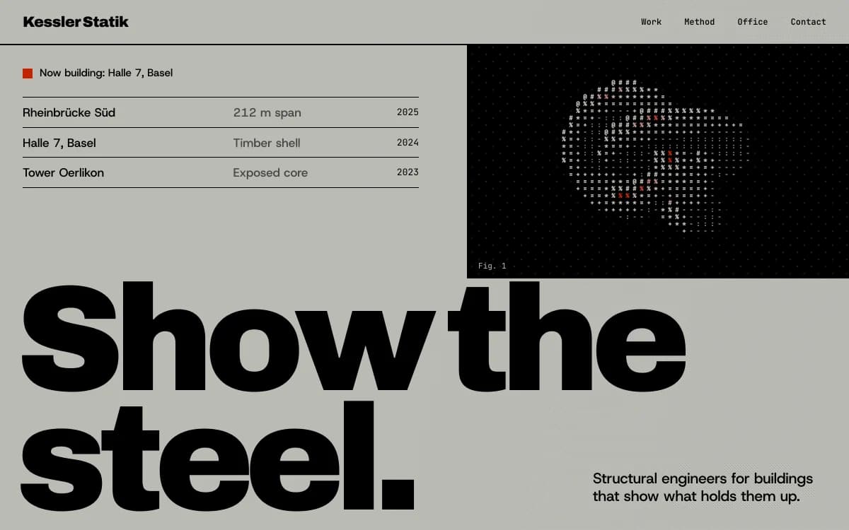
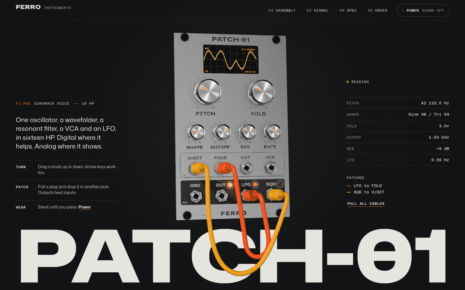
Swiss Brutal makes information the ornament: a strict grid, heavy grotesque type, hairline rules carrying data. It suits designers, developers and architects whose work is about systems and precision. Done badly, it reads as cold; the fix is one human detail, such as a handwritten note or a personal project given real space.
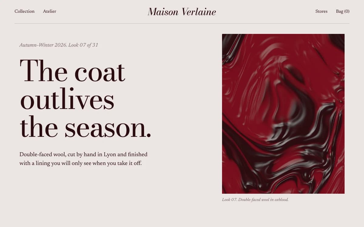
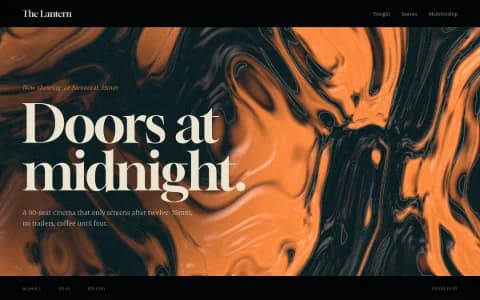
Editorial Luxe borrows the magazine spread: a Didone display face at extreme sizes, literate serif text, tall portrait crops. It fits fashion, writing, art direction and anyone whose work lives in print.

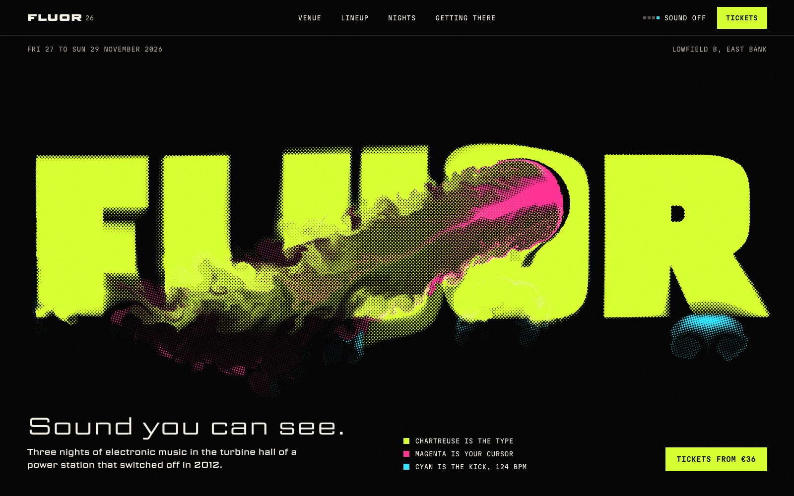
Kinetic Type lets the letters move: wide, loud display type that reacts to scroll and cursor. It suits motion designers and brand designers, because the site demonstrates the skill. It's wrong for anyone whose work needs quiet attention.
Type matters more than colour here. If you want your portfolio to look like nobody else's, start by not using the same three typefaces as everybody else: our guide to choosing fonts that aren't Inter has pairings with reasons.
Where 3D and motion belong in a portfolio
Motion in a portfolio should prove something about your practice. Two examples from showcase sites made by the Laarpi team with Laarpi's library and process:
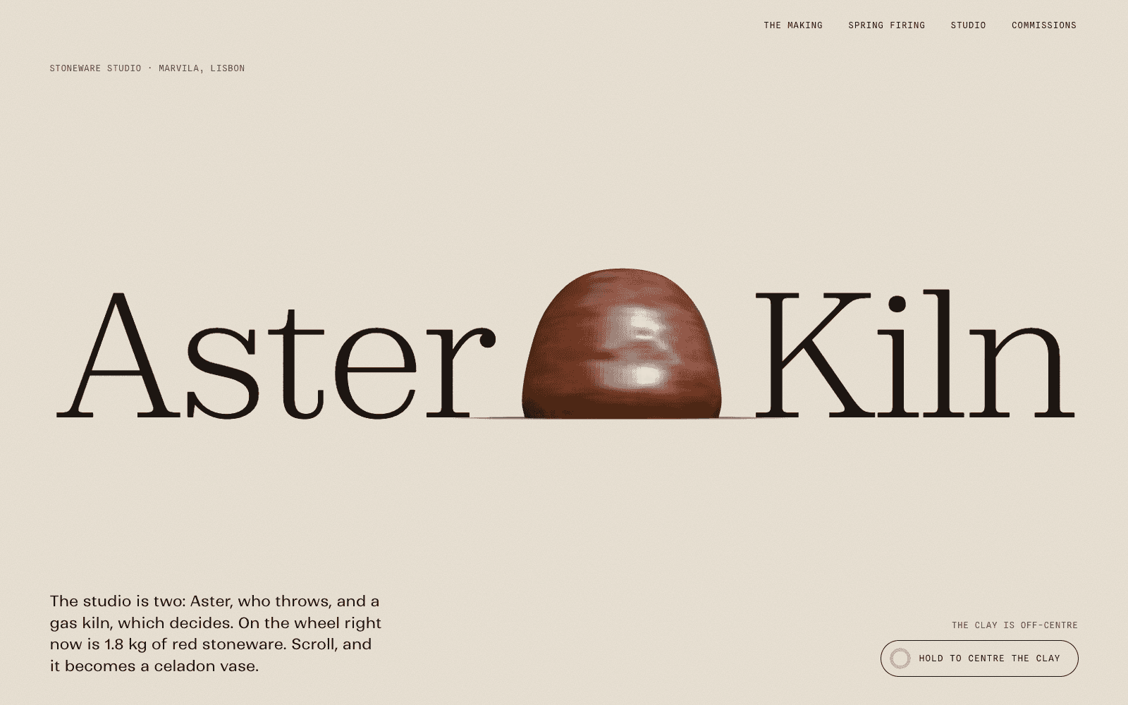
Aster & Kiln is a showcase site for an imagined one-person stoneware studio in Lisbon. Its portfolio is the process: scroll throws a vase on the wheel, trims it, glazes it and fires it behind a kiln spyhole, and then the finished pieces sit on one shelf line at their true relative sizes, each with a catalogue number and a buy button. The 3D isn't decoration. It shows a buyer what goes into the price.
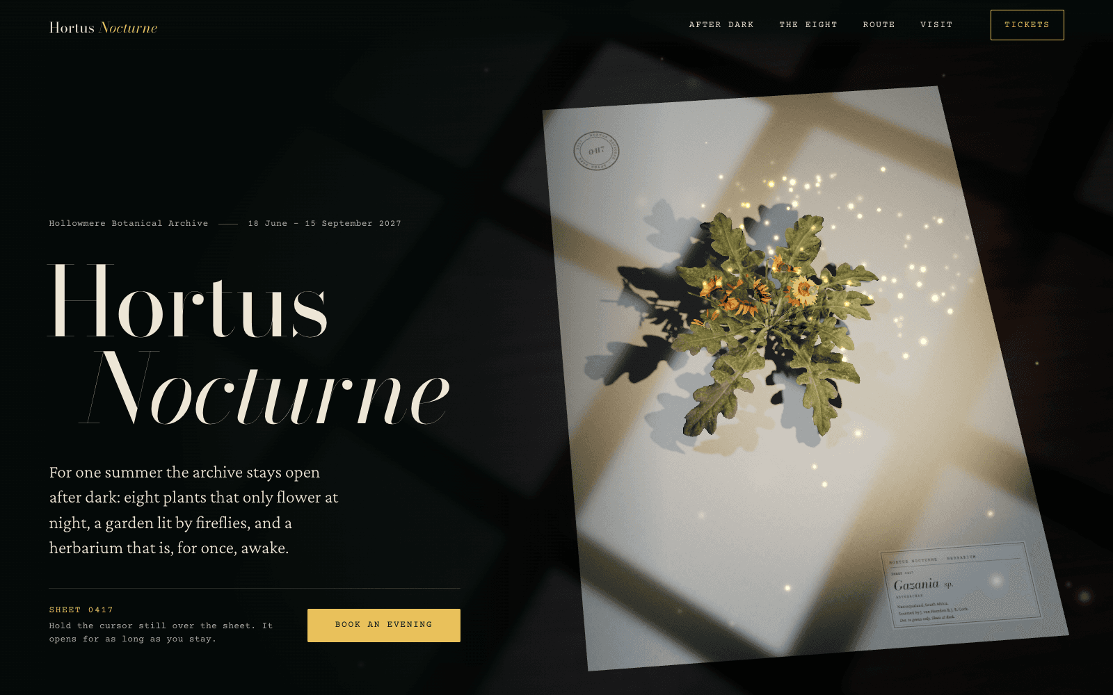
Hortus Nocturne is a showcase site for a night-garden exhibition. A pressed flower on a herbarium sheet stands up and blooms only while you hold the cursor still over it. One interaction, one idea, and it states the concept faster than any paragraph could.
Both are live in the community, where any published site can be remixed into a starting point of your own.
The rules we apply to portfolios:
- The work loads first. Text and images render before any 3D, and the 3D fades in when it's ready.
- One signature moment, tied to what you do. Not a different effect in every section.
- A composed still version for visitors who set their system to reduce motion. See accessible motion for how to do it properly.
- Mobile composed for mobile, not a shrunk desktop. Many reviewers first open your link on a phone, from an email.
More on how motion is used with intent on the animated websites page.
How Laarpi builds a portfolio website
Laarpi is a coding agent. You describe your practice in a sentence or a paragraph, attach a few images if you have them, and press Start building.
It asks only what changes the result. For a portfolio that might be: "Is this for studios hiring a senior designer, or for clients commissioning work?" or "Should the work be shown big and quiet, or should the site itself be a piece?" The questions arrive as cards in the chat, with palette swatches and real type specimens to choose from. If your description is already specific, it skips the questions.
It writes a plan you can edit. The idea, the sections, the type with reasons, the palette as hex values, the motion. Change any line and the next build follows your version.
It builds real code, then looks at it. The agent takes screenshots of its own work, checks the layout at six widths from 1920 down to 390 pixels for overlapping text, overflow and broken words, and hands the screenshots to a separate art director that scores the site on eight criteria, from concept clarity to mobile and originality. On a Finish, it revises at least twice before it calls the site done.
You direct it. Click a project tile and say "bigger, and put the year under it". Only that part changes, and every version is kept.
It ships. Publish to a laarpi.site address in one click, or connect your own domain. A contact form can save enquiries to your own Supabase project.
What to bring
| You bring | Why it matters |
|---|---|
| Your best 4–8 projects, with images | The agent never invents work, clients or testimonials |
| One or two lines per project | Context makes case studies; it can draft the rest for you to correct |
| The person you want to reach | A studio hiring a senior designer needs a different site from a client commissioning a mural |
| A link or two you admire (optional) | Reference images help the conversation; the agent won't copy them |
Where your words are missing, it writes specific placeholder copy that is clearly yours to replace, never filler Latin.
Portfolio website checklist
- One sentence that says what you do, in the first screen
- Strongest project first, 4–8 selected projects in total
- Every project page: context, problem, decisions, result, credits
- Images sized properly, with alt text that describes the work
- Clear contact route: an email address at minimum
- Works on a phone, composed for it
- A reduced-motion version if anything moves
- Your own domain once you share it widely
When a Laarpi portfolio isn't the right fit
A Laarpi portfolio is a designed site in real code, not a theme with a content editor. That is the point: it can look like nothing else. It also means changes happen through the chat or in the code, not through a CMS dashboard. If you add work every day and want a team to manage content, a CMS-based builder will suit that rhythm better. If you add a few projects a year and want the site to be a piece of work in its own right, this is what Laarpi is for.
For related sites, see photography portfolios, architecture portfolios and agency websites. When you're ready, describe your practice on the home page and start building.