Directions, not templates
A direction is a starting point for taste: palette, type, layout and motion that belong together. The agent picks one from your idea, or you do. The site is still designed from scratch.
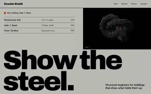
Swiss Brutal
A style for architects, engineers and studios whose work is precise: the discipline of Swiss typography with the honesty of brutalism. What defines it, the palettes and type behind it, and how to avoid its clichés.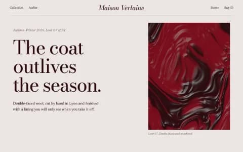
Editorial Luxe
A style for fashion houses, photographers and publishers who would rather be read than skimmed. What makes a site feel like a magazine spread, the type and palettes behind it, and where it goes wrong.
Kinetic Type
A style for festivals, labels and studios with a strong name and few images, where the type does the work photography usually does. How it moves, what it is built from, and how to keep it readable.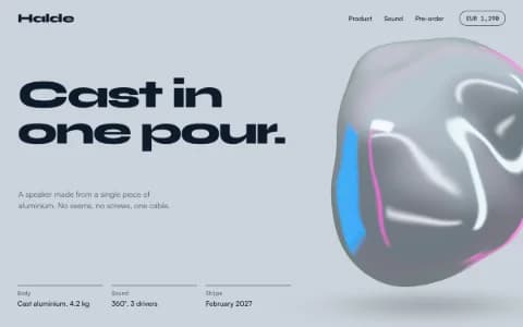
Liquid Chrome
A style for product launches that want a tactile hero instead of a screenshot. How one real-time object carries the page, the palettes and type around it, and how to keep the shine from turning into a cliché.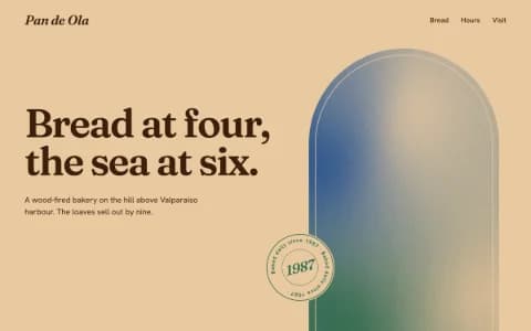
Analog Warmth
A style for bakeries, cafés, makers and family businesses with a story and a place. How to make a site feel printed and handled, the type and palettes behind it, and what to prepare.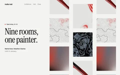
Gallery White Cube
A style for painters, photographers and galleries who want the work to do all the talking. How the white-wall approach works on screen, the type and palettes behind it, and how to prepare the hang.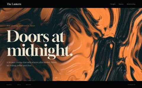
Cinematic Noir
A style for cinemas, late-night places, releases and stories that happen after dark. How to make a site feel like a film, the grade and type behind it, and how to keep dark pages readable.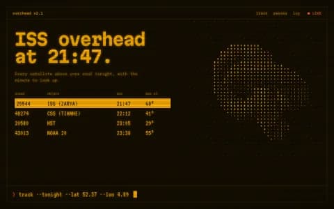
Retro-Futurist Terminal
A style for science projects, developer tools and hardware whose facts are part of the appeal. How the console look works on screen, the phosphor and blueprint palettes, and the clichés to avoid.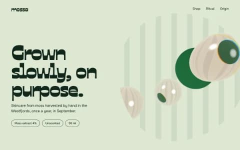
Organic Biomorph
A style for skincare, botanical, ocean and life-science brands that should feel alive. How soft, living forms are built without crude stand-ins, the palettes and type behind them, and where the style goes wrong.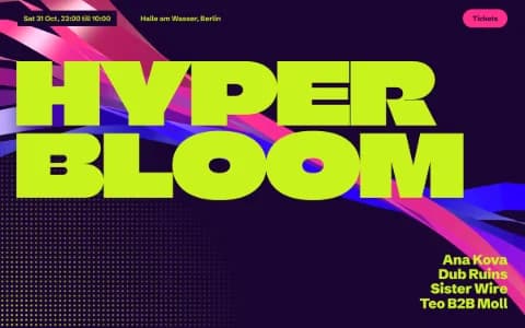
Acid Rave
A style for club nights, festivals and labels that should feel like a night out. How to get flyer energy on screen while keeping dates, lineups and tickets easy to find, and the safety rules for loud motion.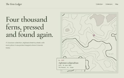
Botanical Archive
A style for gardens, museums, perfumers and anyone with a collection to show. How the logic of plate, label and ledger becomes a website, the type and palettes behind it, and what to prepare.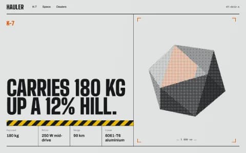
Industrial Spec Sheet
A style for hardware, tools, gear and manufacturers whose numbers are part of the pleasure. How to make a datasheet desirable, the type and palettes behind it, and how to write specs people read.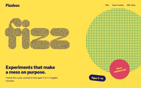
Playful Toybox
A style for toy makers, kids' brands, snacks and anything that should make people grin. How to be playful without being childish, the type and palettes behind it, and how to serve both the player and the payer.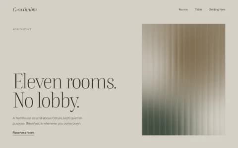
Quiet Luxury
A style for boutique hotels, small restaurants and makers of fine goods whose customers do not want to be shouted at. How restraint becomes a material, the details that signal quality, and what to avoid.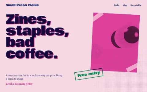
Riso Zine
A style for zine fairs, bookshops, small labels and community events. How risograph printing translates to the screen, why overprinting is the whole trick, and how to avoid a site that looks like a filter.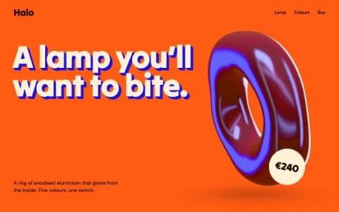
Dimensional Pop
A style for consumer product launches with one hero object and a sense of fun. How faux-3D type and a glossy real-time object share the page, the hot palettes behind it, and how to keep it focused.
Start building
Describe the site in a sentence. It asks what matters, then designs and builds it from scratch.