Swiss Brutal: the grid, the grotesque and nothing to hide
A style for architects, engineers and studios whose work is precise: the discipline of Swiss typography with the honesty of brutalism. What defines it, the palettes and type behind it, and how to avoid its clichés.
Palette and type
Palette
- Ground#BBBBB5
- Surface#AEAEA8
- Ink#000000
- Muted#474745
- Accent#C22300
- Accent 2#0033FF
- Line#969691
Brutal concrete
Raw concrete mid-grey, true black, and a primary red/blue pair. No softness anywhere.
- Ground#F4F4F1
- Surface#E3E3E0
- Ink#000000
- Muted#6B6B6A
- Accent#D7261E
- Accent 2#5B6B7A
- Line#C3C3C1
Gallery white
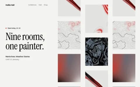
White-cube walls, true black for type, and the red of a museum's sold dot. Nothing else competes with the work.
- Ground#E2E4E3
- Surface#D4D6D5
- Ink#16191B
- Muted#5F6263
- Accent#E04F00
- Accent 2#E8B800
- Line#B9BBBB
Hazard spec
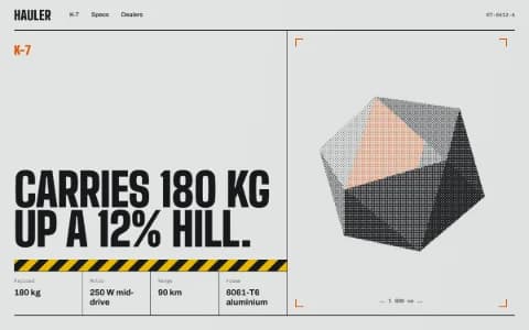
Machine-grey ground and graphite ink, with safety orange and hazard yellow used the way an engineer would: to mark what matters.
Type
Swiss Brutal
Archivo
Raw grid, heavy grotesque, true black on concrete. Information is the ornament: rules carry data, type carries the voice, nothing is rounded.
Host Grotesk
Archivo / Host Grotesk / 0123456789
JetBrains Mono
- Layout
- Strict 12-col grid, flush-left everything, oversized fitted headlines bleeding to the page edge, data rows with hairlines, zero radius, generous dead space used as tension.
- Motion
- Hard and fast: char reveals on headlines, scramble on labels, marquee bands with scroll velocity; no easing flourishes, no parallax.
Try it with a prompt
“A structural engineering practice. Projects as a ledger: name, span, material, year. One building rendered in characters.”
Start building in Swiss BrutalSwiss Brutal is what happens when the most disciplined tradition in graphic design meets the most honest one. From Swiss typography it takes the grid, flush-left setting and the belief that information is the ornament. From brutalism it takes the refusal to round a corner, add a shadow or apologise.
The result is a site that looks built rather than decorated. Rules carry data. Type carries the voice. Nothing is soft.
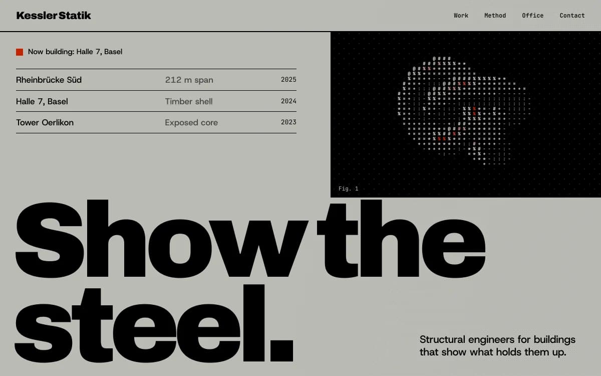
The specimen above, for a fictional firm of structural engineers, shows the core moves: a headline so large it bleeds off the page, a project list set as a ledger with hairline rules, and a single 3D object rendered as characters, black on concrete.
Where it comes from
The International Typographic Style grew up in Zurich and Basel in the 1950s. Its designers set type in sans-serif faces, flush left with a ragged right edge, on mathematical grids, and let photography and information speak without ornament. Josef Müller-Brockmann's book Grid Systems in Graphic Design is still the clearest statement of the method.
Brutalism comes from architecture, from the French béton brut, raw concrete. In the mid-2010s the word attached itself to a wave of websites that exposed their structure on purpose: system fonts, visible borders, no polish. Many were provocations. Swiss Brutal keeps the honesty and adds back the craft.
What defines it
| Element | The Swiss Brutal choice | Why |
|---|---|---|
| Grid | A strict 12-column grid, everything flush left | Alignment you could draw lines through reads as confidence |
| Headlines | Oversized grotesque, fitted to the width, bleeding to the edge | Scale contrast replaces decoration |
| Information | Data rows with hairline rules: year, span, material | The facts are the most interesting thing on the page |
| Corners | Zero radius, everywhere | Rounded corners are a softening this style refuses |
| Colour | True black on concrete grey or gallery white, one primary accent | Contrast does the work |
| Space | Generous dead space, used as tension | Empty is not unfinished |
Palettes
Every palette in this direction keeps a true or near-true black ink and a single hard accent.
| Palette | Ground | Ink | Accent | Character |
|---|---|---|---|---|
| Brutal concrete | #BBBBB5 | #000000 | #C22300 | Raw mid-grey with a primary red and blue pair |
| Gallery white | #F4F4F1 | #000000 | #D7261E | White walls and the red of a sold dot |
| Hazard spec | #E2E4E3 | #16191B | #E04F00 | Machine grey with safety orange and hazard yellow |
Type
- Display: Archivo. A workhorse grotesque with a wide width axis. At heavy weights and condensed widths it stacks into blocks that hit hard.
- Text: Host Grotesk. Neutral and contemporary, with tight apertures that stay crisp at small sizes.
- Mono: JetBrains Mono. A tall x-height makes figures and labels readable in dense data rows.
All three are free for commercial use under the Open Font License. The agent can reach for other grotesques if the concept calls for it, but it will not default to the most overused sans-serifs on the web. The guide to choosing fonts that aren't Inter explains why.
Motion and depth
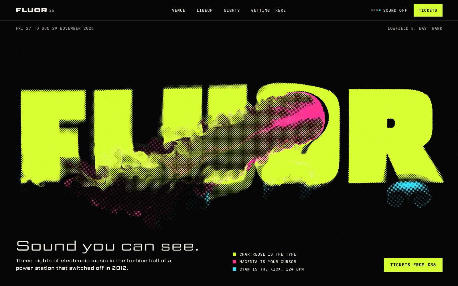
Motion here is hard and fast. Headlines reveal character by character, labels scramble into place, and marquee bands respond to scroll velocity. There is no parallax and no easing flourish.
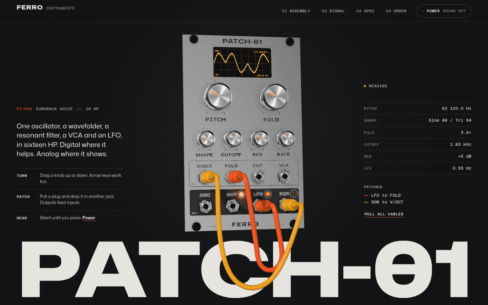
Depth arrives as information, not spectacle: an object rendered as an ASCII character grid, or a field of topographic contour lines that rise under the cursor. A dither texture adds grain without blur.
A typical page, section by section
Every site is designed for its own idea, so treat this as a sketch, not a template. A page in this style often runs like this:
- A monolith hero. One fitted headline, edge to edge, and a single line of plain information under it.
- The ledger. Projects or products as rows with hairline rules: name, place, figure, year. Hovering a row reveals its image.
- The index. Selected work as a numbered list in large type, not a grid of thumbnails.
- Scale. Two or three figures set huge, each with a one-line caption saying what it measures.
- Questions, split. The question on the left column, the answer on the right, aligned to the grid.
- Contact as a letter, then a footer with the name set at full width.
Who it suits
| A strong fit | A poor fit |
|---|---|
| Architecture and engineering practices | Wellness, care and hospitality brands that need warmth |
| Design and branding agencies with a point of view | Children's products |
| Publishers, research groups, archives | Luxury brands that sell softness |
| Developer tools that want to look serious | Anyone who would rather not be noticed |
More on these in the use cases for architecture portfolios and agency websites.
How it goes wrong
Brutalism has its own clichés, and generated sites hit all of them:
- Raw as an excuse. Unstyled defaults and broken layouts passed off as a statement. Swiss Brutal is raw in tone, never in craft.
- Black borders around everything. Boxes are not a grid. Hairline rules separate information; they do not frame it.
- Shouting at every size. If every heading is enormous, none of them is. One headline per screen gets the scale.
- Broken words. Giant fitted headlines break badly on phones. Laarpi sizes single-word headlines to fit and never breaks a word across lines, at all six widths it checks.
- Unreadable contrast. Grey text on grey concrete fails accessibility. Every ink is checked against its ground.
Making it yours
The specimen is a starting point, not a template. Push it in the direction of your work:
- "A structural engineering practice. Projects as a ledger: name, span, material, year. One building rendered in characters."
- "A type foundry. Each typeface shown at a size that fills the screen, specimens as data."
- "An architecture research group. Papers listed like a library catalogue."
For something more technical, see Industrial Spec Sheet. For more silence and less shouting, see Gallery White Cube. For type that moves, Kinetic Type. To understand how Laarpi turns any of these into a finished site, read about the AI website builder.