A musician website that feels like the record
What an artist, band or label website needs for fans, press and promoters, how to build a release page around one idea, and how Laarpi designs one from the music outward.
Most musician websites look like they were made by the same person, because they were: the same theme, the same hero photo, the same row of streaming logos, the same "Tour" and "Shop" tabs. Then the record itself sounds like nothing else, and the site doesn't carry any of that across.
Music is the easiest thing in the world to build a site around, because every record already has an idea, a mood and a cover. A good musician website starts there. This page covers what an artist, band or label site needs, how to build a release page around one idea, and how Laarpi does it.
Who visits a musician website
Four kinds of visitor, each with a different reason:
| Visitor | What they want | Where it goes |
|---|---|---|
| Fans | The new record, dates near them, a way to buy something | The home page, first screen |
| Promoters and bookers | Live footage, tech needs, a booking contact | A press or booking page |
| Journalists and curators | Biography, press photos, the story behind the record | A press kit page with downloads |
| Labels and collaborators | A sense of where you're going | The whole site, frankly |
The home page should belong to the present: the current release or the current tour. Everything else can live one click away.
The release page is the centre
A release page is the most useful thing a musician website can have. It works as the link in every post, the page press lands on and the place fans buy. Build it around the record's idea, not a template.
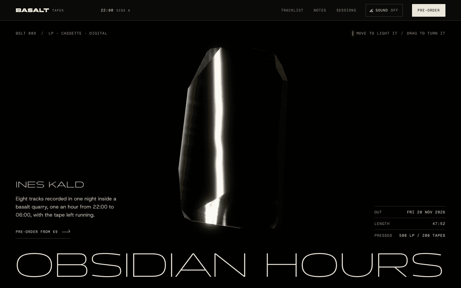
BASALT Tapes: Obsidian Hours is a showcase release page made by the Laarpi team with Laarpi's library and process for an imagined LP recorded overnight in a basalt quarry. The record is a slab of obsidian you light with your cursor and turn by dragging. As you scroll it breaks into eight shards, one per track, and the clock in the navigation runs from 22:00 to 06:00 as you go. Under a loupe, the fracture rings straighten into a record's grooves, with each band on Side A sized by that track's real duration. Then the shards close back into one slab beside vinyl, cassette and download. Every piece of the page is about the record.
What it gets right, and what you can borrow without the 3D:
- One idea, carried all the way through. The night, the glass and the tracklist are the same idea.
- Facts set like a label on a specimen drawer: release date, length, edition sizes. Specific beats hype.
- A plain order section at the end. Atmosphere first, then a simple way to buy.
Lineups, dates and live shows
For live work, the page is about when and where. Dates must be scannable: date, city, venue, ticket link. Nothing else on that row.
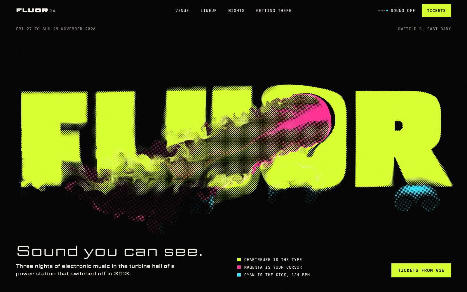
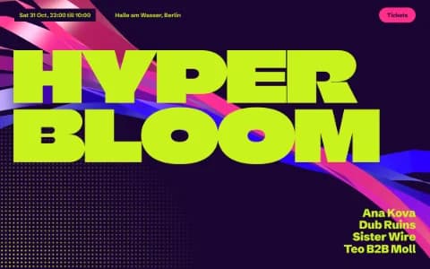
FLUOR 26 is a showcase site for an imagined three-night electronic music event in a disused power station. The wordmark is printed in fluorescent ink you can stir with your cursor, and a cyan kick pushes the ink at 124 BPM. The lineup sets each name at its own tempo, slowest and widest first, using a typeface with a variable width axis. Point at a name and it melts into the ink while the kick switches to that artist's BPM. Then the timetable and the tickets are plain, readable rows.
That pattern, a loud idea at the top and a calm, scannable practical section below, is the one to steal for any musician site with dates on it. For festivals and club nights in more depth, see the event website page.
Both sites are live in the community. Remix one and you start from its code and plan, then direct it towards your own record.
Choosing a look for the music
Some directions that suit different kinds of music, as starting points:
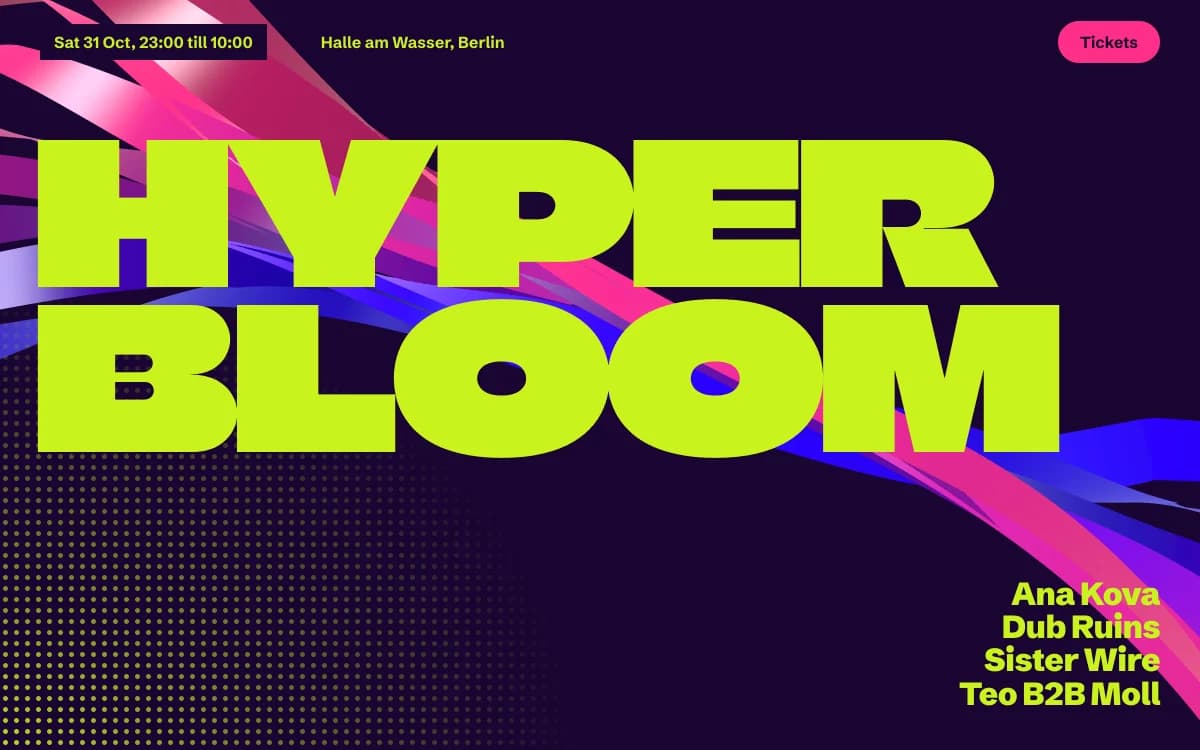
Acid Rave has flyer energy: lime grounds, violet ink, melting type and ribbons of light. Right for club music, labels and festivals.

Kinetic Type makes the letters the moving image. Right for artists whose identity is typographic, and for anything with a beat you can see.
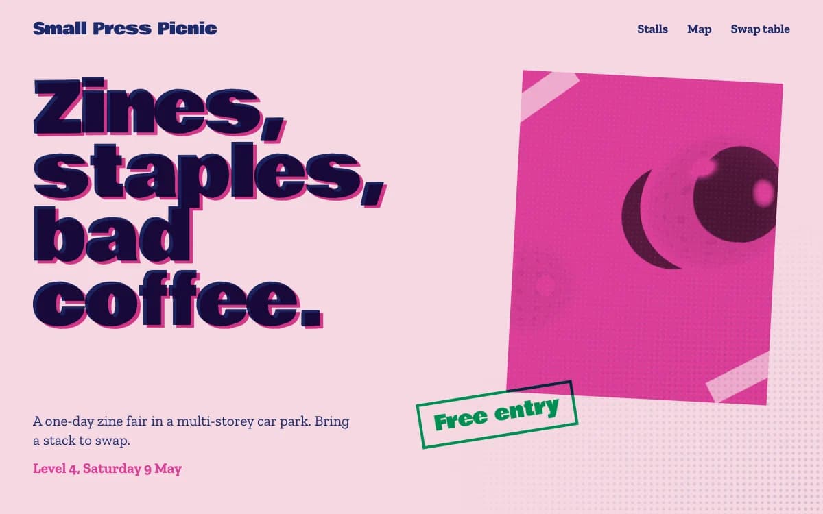
Riso Zine is self-published and proud: risograph colours, halftone dots, slightly off registration. Right for punk, indie and small labels with a DIY practice.
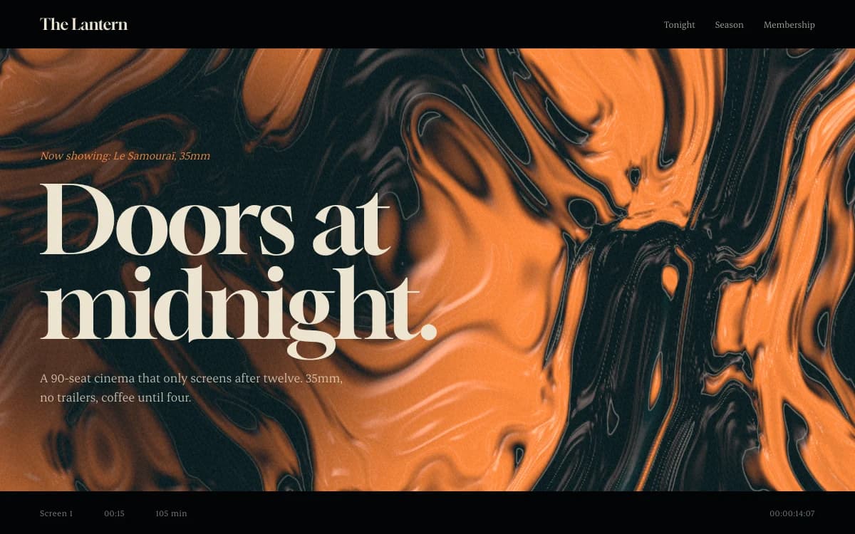
Cinematic Noir is graded like a film still. Right for scores, singer-songwriters and anything late at night.
Type is most of a music site's identity. Our guide to choosing fonts that aren't Inter has pairings that carry a mood.
Sound on the page
Sound is the obvious thing to add and the easiest to get wrong.
- Never autoplay. Browsers block it, and it's hostile to anyone in an office, on a train or using a screen reader. Laarpi sites make no sound until the visitor asks for it.
- Embed what you already use. Players from Bandcamp, SoundCloud or Spotify can sit inside the design rather than on top of it.
- Visuals that respond to music can be beautiful, but they must never flash more than three times a second. See accessible motion for the rules and why they matter.
Selling and the mailing list
Here is what Laarpi wires up, and what it leaves to the tools built for it:
- Mailing list. A sign-up form that saves addresses to a table in your own Supabase project. The list is yours, exportable to any newsletter tool.
- Digital sales. Downloads, stems and digital editions can sell through checkout from your own Polar account, connected to the buttons on your page. Customers and revenue go straight to your account. See website payments.
- Physical formats and merch. Polar is built for digital goods, so vinyl, cassettes and shirts link to your label store or shop, presented inside your design.
- Tickets. Link to the ticketing service the promoter uses.
- Press kit. A page with a short and a long biography, downloadable press photos with credits, and a contact. Journalists will thank you.
Musician website checklist
- The current release or tour in the first screen, with listen and buy links
- A release page you can share as the link everywhere
- Dates as scannable rows: date, city, venue, tickets
- A mailing-list form that saves to a list you own
- A press kit: short and long biography, press photos with credits, contacts
- Real text for tracklists, credits and dates, so they can be searched and read aloud
- No autoplay, and no visuals that flash more than three times a second
- Your own domain, so the link outlives every platform
How Laarpi builds a musician website
Describe the music and the release, attach the cover art and a press photo, and press Start building.
It asks what changes the site. For example: "Should the site feel like the sleeve or like the live show?" or "Is this page for the album launch, or a home for everything you do?" The questions arrive as cards with real palettes and type specimens.
It writes a plan you can edit: the idea, the sections, the type and palette with reasons, and what moves and why. Change any line and the next build follows your version.
It builds real code and looks at its own work. It screenshots the site, checks the layout at six widths for collisions and broken words, and has a separate art director score it on eight criteria, from concept clarity and 3D to motion and originality. On a Finish, it revises at least twice.
You direct it. Point at the tracklist and say "durations in mono, please", or tell it the release date moved. Only that part changes, and every version is kept.
It ships. Publish to a laarpi.site address, or your own domain on a paid plan.
What stays with your store, label and ticketing
Laarpi builds a site designed around your music, in real code, with your own accounts behind the forms and the checkout. It isn't a merch warehouse, a ticketing system or a streaming service, and it links to those rather than replacing them. If you want a site that sounds like the record before anyone presses play, this is what it's for.