A product launch page that converts, beat by beat
How to plan, write and structure a product launch page around one action: positioning, the order of beats, headlines, calls to action, honest proof, waitlists and what to measure.
A launch page has one job: get the right people to take one action. Join the waitlist, pre-order, start a trial, buy. Everything on the page should make that action more likely for someone who'd genuinely want the product, and nothing should get in their way.
That sounds obvious, and most launch pages still miss it. They open with a slogan that could belong to any product, list features nobody asked about, borrow trust they haven't earned and scatter four different buttons across the page. The launch page best practices in this guide cover planning, structuring and writing a page that converts, beat by beat, with examples from showcase pages made by the Laarpi team with Laarpi's library and process.
Decide the one action first
Before a word is written, decide what the page is for. Pick one:
| Stage | The one action | What the page must do |
|---|---|---|
| Before launch | Join the waitlist | Make the idea irresistible; ask almost nothing |
| Launch | Pre-order or buy | Answer every serious objection; make paying easy |
| Software launch | Start a trial or sign up | Show the product working; remove risk |
| After launch | Buy, with confidence | Add real proof as it arrives |
Then measure that action and only that action. Clicks, scroll depth and time on page are diagnostics, not results.
Write the positioning before the page
If you can't say what the product is in one sentence, the page can't either. Fill this in honestly:
For [who], who [need or frustration], [product] is [what it is] that [the one thing it does], unlike [the alternative they use today].
You won't publish that sentence, but every headline, section and button should be consistent with it. Then list the objections: the reasons an interested person wouldn't buy. Price, trust, compatibility, effort, timing. Get them from support emails, sales calls, community threads, or by asking ten people in your audience. The page's job is to answer them in order.
The beats, in order
A launch page is read top to bottom, so plan it as a sequence of beats, each answering the next question in the visitor's head.
| Beat | The visitor's question | What works | Common failure |
|---|---|---|---|
| Hook | What is this, and is it for me? | Name, one plain sentence, the action | A slogan with no information |
| Show | What does it look like? | The real product, big, or working | A mock-up with invented data |
| Difference | Why this and not the other one? | One idea, explained properly | Twelve features of equal weight |
| How it works | Will it work for me? | Steps, with the real interface or object | Abstract icons |
| Specifics | What exactly do I get? | Specs, contents, compatibility, limits | Hiding the details people need |
| Proof | Can I trust it? | Real proof: demo, specs, makers, process | Invented testimonials and logos |
| Price | What does it cost, when do I get it? | Price, shipping date, what's included | "Contact us" for a simple product |
| Objections | What if…? | An FAQ answering the real objections | An FAQ of softballs |
| Action | How do I get it? | The same primary action, again | A new, different button |
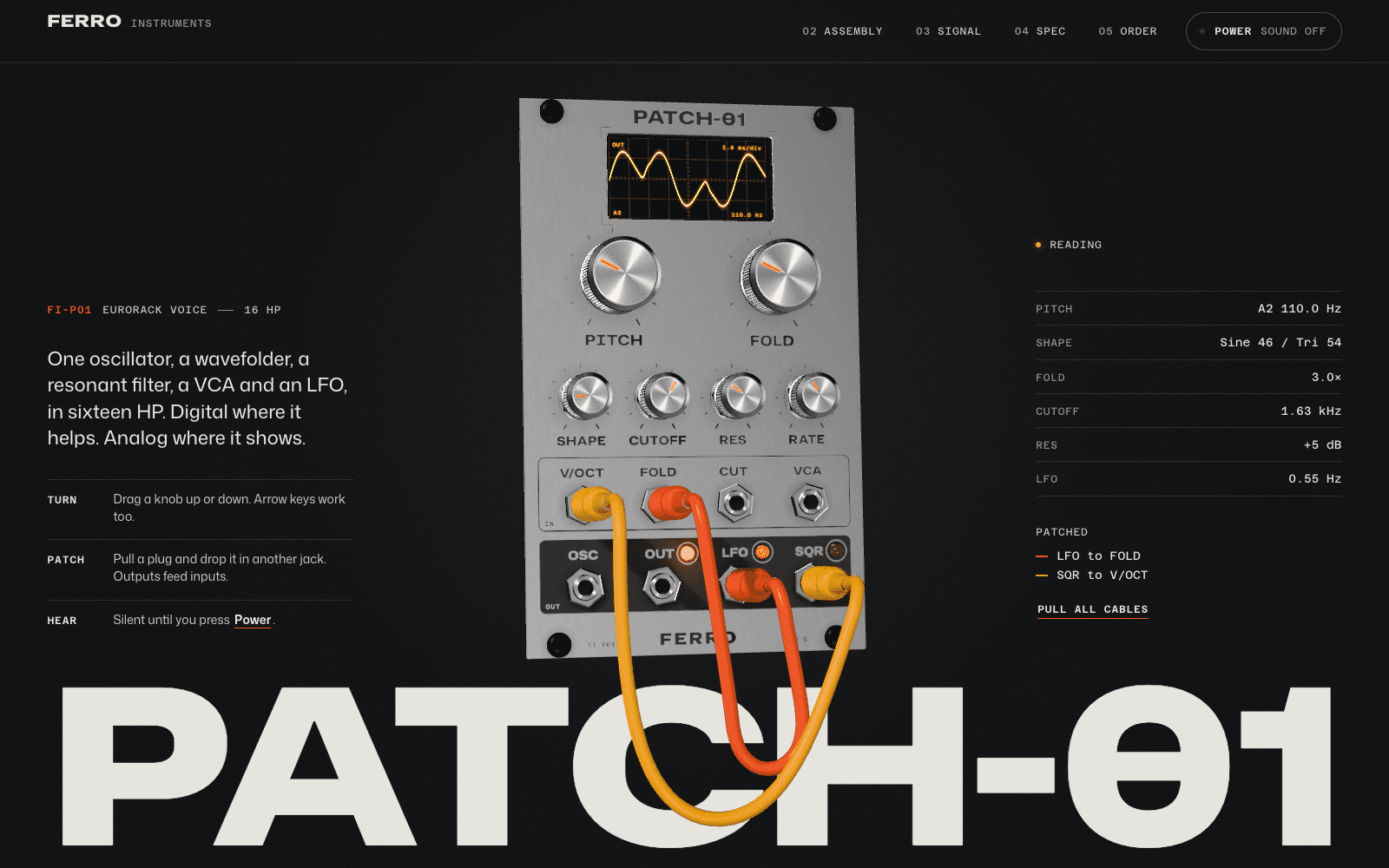
PATCH-01, a showcase launch page made by the Laarpi team with Laarpi's library and process for an imagined synthesizer module, follows this order. The hook names it and lets you play it: "One oscillator, a wavefolder, a resonant filter, a VCA and an LFO, in sixteen HP. Digital where it helps. Analog where it shows." The show and difference beats are the module turning and separating into its layers. The specifics beat is a paper datasheet with drawings and a spec table. The action beat returns to the module with a finish switch and the price.
Headlines that can't be swapped
The test for a launch headline: could a competitor paste it onto their page unchanged? If yes, it's not doing its job.
| Swappable | Specific |
|---|---|
| "The future of sound" | "A Eurorack voice you can play in the page" |
| "Your workflow, reimagined" | "Turn a support inbox into a searchable FAQ overnight" |
| "Built for creators" | "Colour grading presets for film photographers, made from real stock scans" |
Other rules that hold up:
- Say what it is before what it means. People need the noun before they care about the benefit.
- Use the customer's words. The ones from those support emails, not the ones from your pitch deck.
- Specifics persuade. Numbers, materials, names, dates, as long as they're true.
- No hype words. They read as filler, and visitors skip them.
Calls to action
- One primary action, in the first screen and again at the end. On long pages, repeat it after the beats that answer big objections.
- Specific labels. "Pre-order PATCH-01" beats "Get started"; "Join the waitlist" beats "Submit".
- Say what happens next next to the button: the price, when it ships, whether a card is needed, how many emails to expect. Only what's true.
- A secondary action, if any, should be visibly secondary and lower commitment.
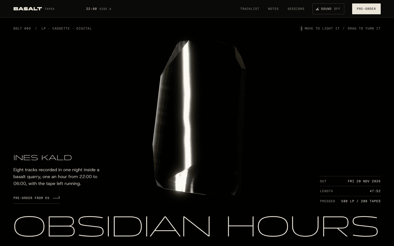
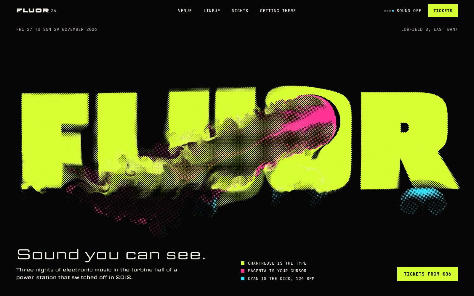
BASALT Tapes: Obsidian Hours, a showcase release page for an imagined LP, puts "Pre-order from €9" in the first screen beside three facts set like a specimen label: release date, length, and how many copies were pressed. At the end, three formats appear as three plain rows with three buttons. Atmosphere in the middle, clarity at both ends.
Both pages are live in the community; remix either one and the beats come with it, ready to be rewritten for your product.
Proof without borrowed trust
New products rarely have reviews, and inventing them is both dishonest and, in many countries, illegal. Proof that's available on day one:
- The product itself, working: a demo, a recording, a configurator.
- Specifics: a spec table, materials, dimensions, compatibility, what's in the box.
- The makers: who's behind it, with real names and faces, and why they built it.
- The process: how it's made or how it works, shown honestly.
- Guarantees you actually offer: returns, refunds, trials.
- Press and customers, only when real and with permission.
Design that serves the beats
The look of a launch page should come from the product, and it should make every beat easier to read.
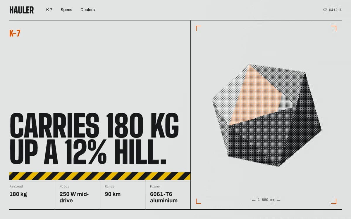
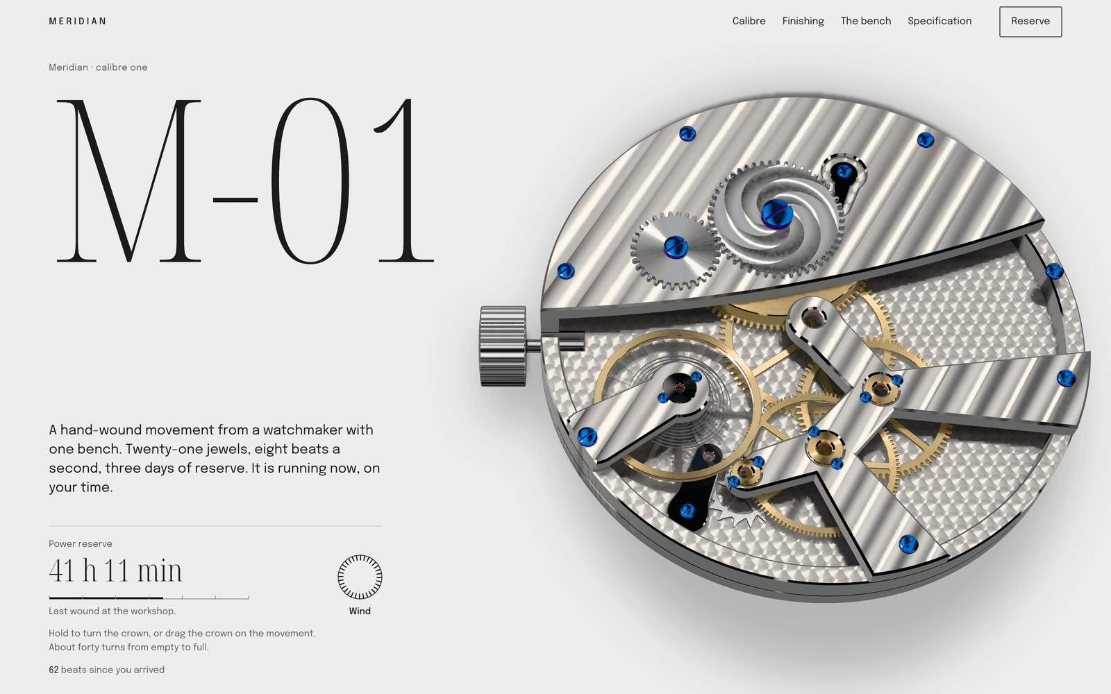
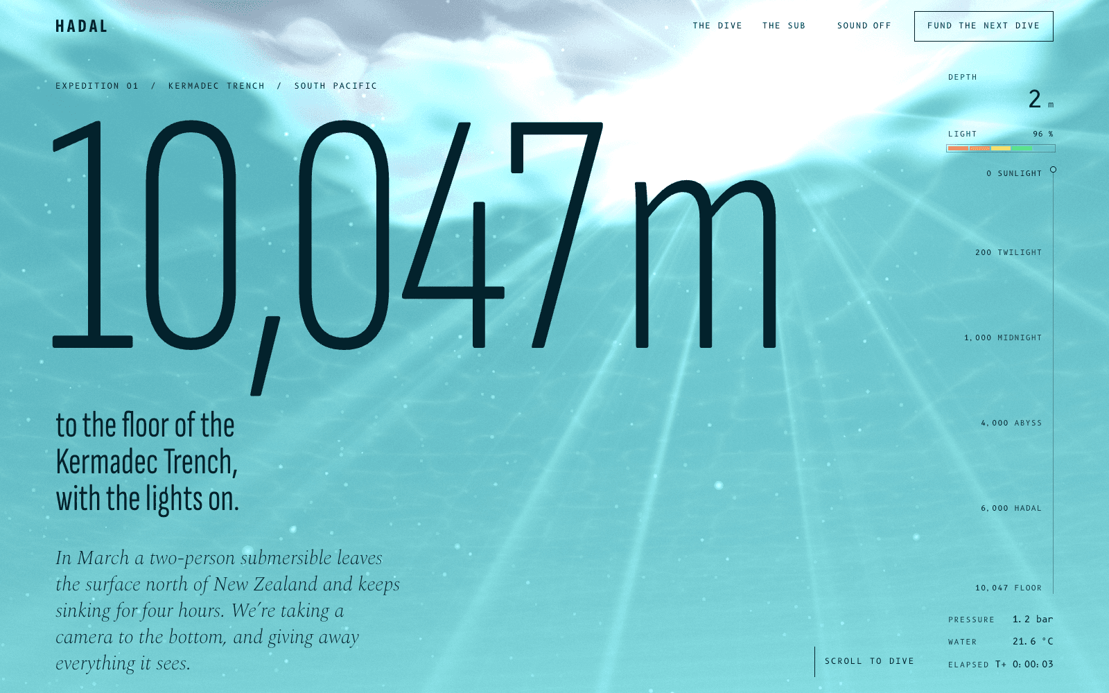
A direction such as Industrial Spec Sheet, with its datasheet layout and safety orange, makes specifics the hero for tools and hardware. For consumer products, a warmer or more playful look may suit better. Typography does more of the work than people expect; see choosing fonts that aren't Inter.
If the product is physical, real-time 3D can let people turn it and see inside it, as long as the text loads first and the 3D explains the product rather than decorating it. See how to build a 3D website.
Waitlists done properly
A waitlist page is a launch page with the price beat removed and the bar for action lowered.
- Ask for an email. At most one more question, if the answer genuinely helps you (which colour, which platform).
- Confirm straight away, on the page and by email, and say what will happen next and when.
- Own the list. Store sign-ups somewhere you control and can export.
- Tell them first. People on the list should hear about the launch before anyone else, and often get something for waiting.
Launch day checklist
- The page loads fast on a phone, with the action visible without scrolling
- The share image and description look right when the link is pasted into messages and social posts
- The checkout or sign-up works end to end, tested with a real payment or account
- Analytics records the one action
- The FAQ answers the questions you've already heard
- Someone is watching the inbox
After launch: improve with evidence
Watch where people drop off, read every question that reaches you, and update the page to answer them. Add real proof as it arrives. If you test variants, test big differences and judge by the one action; small tests on small traffic produce noise.
Building a launch page with Laarpi
Laarpi is a coding agent that builds launch pages from a description. It asks the questions that change the page (is this a waitlist or a sale on day one; should people be able to use the product on the page), writes a plan with the beats in order that you can edit, and builds it in real code. Checkout for software and digital products runs through your own Polar account, wired to your buttons; waitlist sign-ups save to your own Supabase project. It checks its work at six widths and has a separate art director score it before revising at least twice on a Finish. See product launch pages and SaaS landing pages for how it works in practice.