Retro terminal design: mission control for your idea
A style for science projects, developer tools and hardware whose facts are part of the appeal. How the console look works on screen, the phosphor and blueprint palettes, and the clichés to avoid.
Palette and type
Palette
- Ground#140E02
- Surface#21180A
- Ink#FFB000
- Muted#AA7601
- Accent#FFD98A
- Accent 2#FF5F1F
- Line#4C3502
Terminal amber
Amber phosphor on a brown-black tube. Muted tones are dimmer phosphor, so everything glows from the same source.
- Ground#123A7A
- Surface#1A4690
- Ink#E8F0FF
- Muted#99ADCE
- Accent#FFD23F
- Accent 2#7FB2FF
- Line#45669A
Blueprint
Blueprint cyanotype blue as the ground with drafting-white ink; yellow pencil for annotations.
Type
Retro-Futurist Terminal
Martian Mono
A mission-control console: amber or blueprint grounds, monospaced everything, data as decoration that is actually data.
Chivo Mono
Martian Mono / Chivo Mono / 0123456789
VT323
- Layout
- Console grid with readouts, ledgers and timetables; numbered processes; ASCII-rendered hero object.
- Motion
- Scramble on every label, counters on figures, ascii-object hero, scanline texture; no soft fades.
Try it with a prompt
“A stargazing club. Tonight's passes, the weather, and how to join the next session.”
Start building in Retro-Futurist TerminalRetro-Futurist Terminal is the future as the past imagined it. A mission-control console. Amber phosphor glowing on a brown-black tube, or white lines on blueprint blue. Monospaced type everywhere. Readouts, timetables and ledgers as decoration, with the twist that every one of them shows real information.
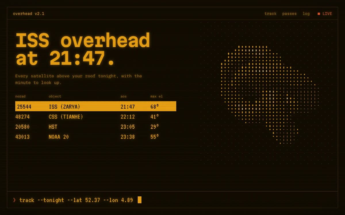
The specimen, for a fictional evening of satellite spotting, makes the point in one screen: "ISS overhead at 21:47." Below it, a table of what passes over tonight, with times and heights above the horizon; to the right, a globe rendered as dots; along the bottom, a command line with the observer's coordinates.
Where it comes from
Before flat screens, computer terminals drew text with glowing phosphor on curved glass. Amber and green were the common colours, chosen because they were easy on the eyes over long shifts. Mission control rooms, laboratory instruments and early arcade machines shared the same look: dark glass, bright characters, dense information.
Blueprints are older still. The cyanotype process, invented in 1842, gave engineers white lines on Prussian blue for more than a century. Both are images of precision, and both feel like the future to anyone who grew up with science fiction.
What defines it
| Element | The Retro-Futurist Terminal choice | Why |
|---|---|---|
| Type | Monospaced, in three roles: wide display, friendly text, bitmap numerals | The console is the voice |
| Ground | Amber phosphor on brown-black, or drafting white on blueprint blue | Light-emitting, not printed |
| Layout | A console grid of readouts, ledgers and timetables | Information is the ornament |
| Process | Numbered, sticky procedures | Step-by-step like a checklist |
| Hero object | A lit 3D form rendered as characters | 3D that belongs on a terminal |
| Texture | Scanlines | The tube, without the blur |
Palettes
| Palette | Ground | Ink | Accent | Character |
|---|---|---|---|---|
| Terminal amber | #140E02 | #FFB000 | #FFD98A | Amber phosphor on a brown-black tube; muted text is dimmer phosphor |
| Blueprint | #123A7A | #E8F0FF | #FFD23F | Cyanotype blue with drafting-white ink and yellow pencil for annotations |
In Terminal amber, everything glows from the same source: the muted tones are the same amber at lower brightness. That is why it feels like one machine.
Type
- Display: Martian Mono. A wide monospace with a width axis that looks like lettering on an instrument panel.
- Text: Chivo Mono. A grotesque-flavoured mono, friendlier than most, so paragraphs stay comfortable.
- Numerals and chrome: VT323. A bitmap face based on a classic terminal's character set. Used only for big figures and interface details, never for reading.
Three monospaced faces sounds like a lot. Each has one job, and the page stays legible because of it.
Motion and depth
Nothing fades softly. Labels scramble into place character by character. Figures count up to their values. Headlines type out. The hero object, a lit 3D form, is rendered straight into a grid of characters, each cell picking a glyph by brightness, with highlights flipping to the accent colour.
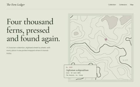
Topographic contour lines can replace the object when the subject is ground, terrain or data. A scanline texture finishes the screen.
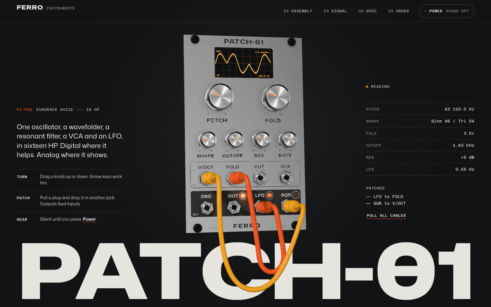
The synth module launch in the community shares this style's instincts: a readout panel beside the product, signal drawn on a scope, and a datasheet that slides over with real front and side drawings and specifications.
A typical page, section by section
Every site is designed for its own idea, so treat this as a sketch, not a template. A page in this style often runs like this:
- The console hero. A headline set in mono on one side, the object rendered in characters on the other, and a live readout.
- The ledger: releases, passes, parts or results as rows that scramble into place.
- The procedure, numbered steps pinned while each one takes its turn.
- The schedule, a timetable with times aligned to the character grid.
- Readouts: the few figures that matter, counting up as they arrive.
- A footer like a terminal's last line: the name, the version, a blinking cursor that does not flash too fast.
Who it suits
| A strong fit | A poor fit |
|---|---|
| Space, astronomy and science projects | Fashion and beauty |
| Developer tools and SaaS launches for technical buyers | Hospitality and food |
| Hardware and audio product launches | Brands that need to feel soft or human |
| Data journalism, hackathons, technical conferences | Audiences who find code intimidating |
More on these in the use cases for SaaS landing pages and product launch pages.
How it goes wrong
- The movie-hacker cliché. Green characters raining down a black screen. It says "film prop", not "instrument".
- Fake data. Random numbers ticking for effect. Terminal style earns trust only when the readouts mean something: real times, real specs, real counts.
- Unreadable body text. Bitmap faces at paragraph size are tiring. Keep them for numerals and chrome.
- Flicker. CRT flicker effects can be uncomfortable and, at speed, dangerous. Nothing on a Laarpi site flashes more than three times a second.
- Everything uppercase. A console with no case contrast is hard to scan. Mixed case for reading, capitals for labels.
What to prepare
- Real data: schedules, specifications, coordinates, version numbers. This style needs facts the way a portfolio needs photographs.
- The procedure: if your product or event works in steps, list them. They become the numbered, sticky process.
Making it yours
- "A stargazing club. Tonight's passes, the weather, and how to join the next session."
- "A command-line tool for photographers. The site is a terminal session that shows what it does."
- "A synth module. The spec table matters as much as the hero."
For a print version of technical precision, see Industrial Spec Sheet. For a calmer grid, Swiss Brutal. For the scientific archive, Botanical Archive. The 3D website builder explains how the character-rendered hero is built, and choosing fonts that aren't Inter goes deeper on picking type with a voice.