Product website examples
Ten product pages where you handle the product, three of them ours with how-they-were-made notes, each with what its interaction proves to a buyer.
A product website has to prove one thing a buyer can't check through a screen: that the product is what you say it is. The best product pages don't argue that point. They hand the product over, so visitors can turn it, open it, configure it or play it, and see for themselves. If you're planning one, the product launch page use case covers the sections and the action; this page is the reference collection.
Ten examples follow: three concept sites we built, then seven public product pages worth studying. Each note says what the interaction proves to a buyer, because that's the part galleries of screenshots leave out.
What a product page has to prove
| Buyer's question | What answers it | Example below |
|---|---|---|
| What is it, really? | The product shown large, from the angles that matter | PATCH-01, Meridian |
| How is it built? | Taking it apart, layer by layer | PATCH-01, Meridian |
| What will mine look like? | A configurator that changes the product, not a swatch | Porsche, Tesla, Nike By You |
| Will it fit my needs? | A comparison or parts picker with real numbers | Apple, Framework |
| Why this odd feature? | A straight answer in the product's own voice | Playdate |
Ours: three products you can handle
These are concept sites made by the Laarpi team with Laarpi's library and process. The brands are invented and the pages say so. They show what a product page can do in a browser; they aren't client work, and they weren't produced end to end by SI, Laarpi's website agent.
PATCH-01: play the instrument
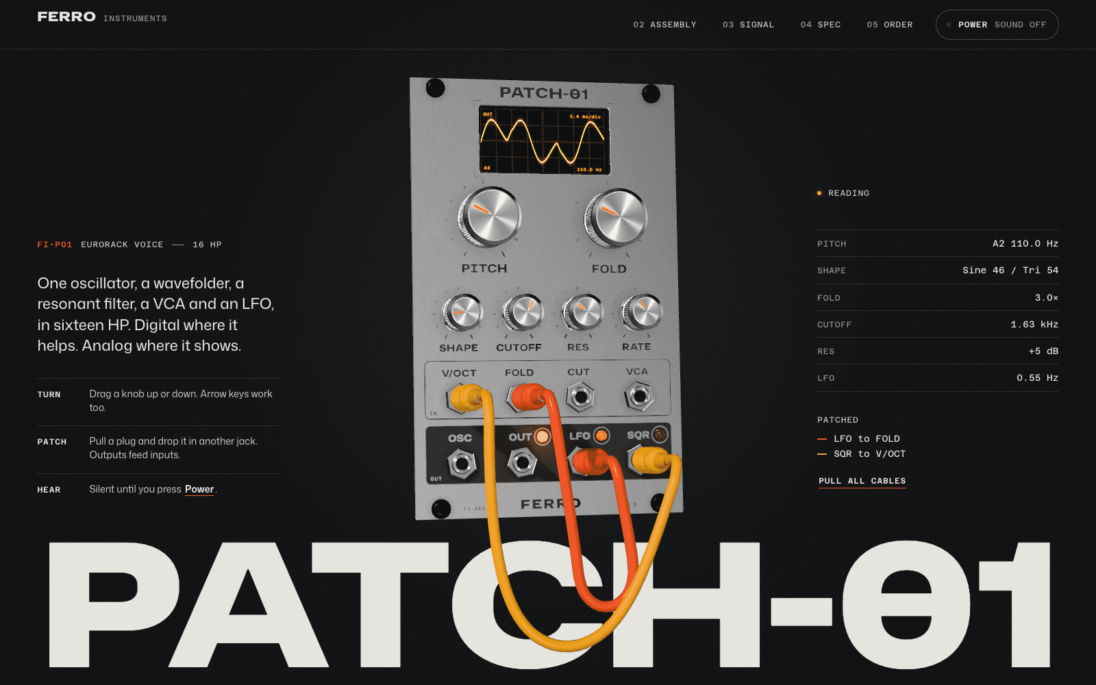
What you do: turn the knobs of a real-time 3D synth module, move patch cables between jacks, press Power and hear it. Scroll and it separates into six numbered layers; the camera then follows the signal through each stage; a datasheet slides over with drawings made from the same layout file as the 3D panel.
What it proves: that it's an instrument with a sound, not a render. Buyers of modular synths judge by the panel and the sound first, so the page leads with them. The teardown proves build quality; the generated drawing proves the dimensions.
The action: pick Raw or Carbon (the panel re-anodises) beside the pre-order button. Full notes in the PATCH-01 write-up.
Meridian M-01: wind it, take it apart
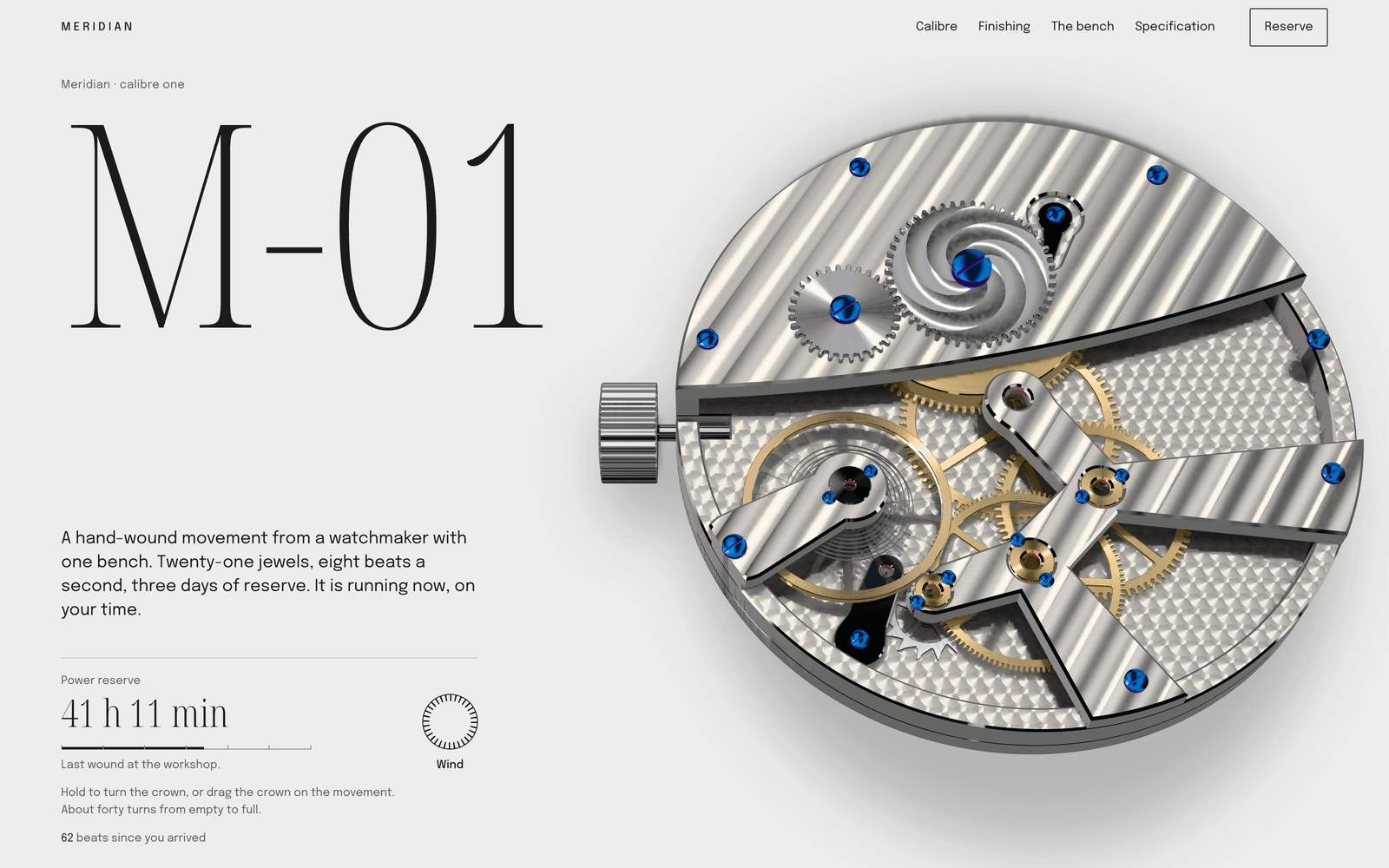
What you do: wind a hand-wound watch movement that runs at your local time and keeps its power reserve between visits. Scroll and it lies flat on a parts sheet in service order; five loupes travel across the finishing; then it reassembles and starts.
What it proves: that the calibre is a coherent machine and the finishing is real. Collectors read movements before dials. The loupes make bevels and perlage legible to someone who has never held one.
The action: a ledger of eighteen numbered pieces beside a deposit button. Scarcity is shown, not claimed. Full notes in the Meridian write-up.
BASALT Tapes: light the record, break it into tracks
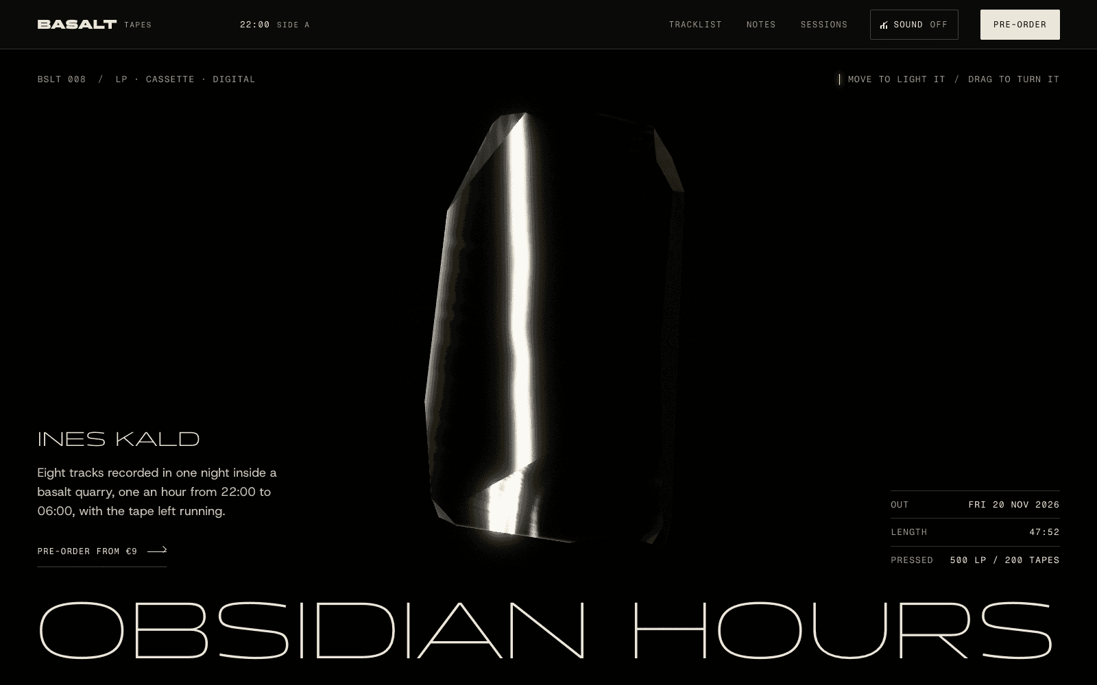
What you do: move a strip of light across a slab of obsidian standing in for an LP, scroll to crack it into eight shards (one per track), and ring each shard with a glass tone.
What it proves: for a cultural product, the page proves the mood rather than the mechanism. The tracklist is the structure of the object, and the format choice at the end (LP, cassette, download) is set as plain ruled rows. Full notes in the BASALT write-up.
All three load text and a progress loader first and the 3D after. Measured cold on our phone profile (slow 4G, CPU slowed four times) on 6 October 2026, the first fully drawn frame took 3.1 s for BASALT, 7.8 s for PATCH-01 and 11.5 s for Meridian. Every write-up explains the trade-off; 3D website examples compares them with five more of our sites.
Public product pages worth studying
These belong to their makers. We link to each and describe what we noticed; open them on a laptop and a phone to compare.
Playdate, by Panic
The handheld's oddest feature is a crank on its side, and the page meets the obvious objection head-on: "The Crank. Yes, the crank. Is it a gimmick? Nah." The specs follow in plain rows. What it proves: that the makers know what you're thinking, and have an answer. Voice can be proof when it's specific. play.date
OP–1 field, by teenage engineering
The product page sets the instrument's capabilities as dozens of short labels around large product photography, so the feature list becomes part of the visual identity. What it proves: depth of capability, at a glance, for buyers who want to know it does everything they'll need. teenage.engineering/products/op-1
Porsche Car Configurator
Every option you choose appears on the car, and the price builds as you go. What it proves: what your car will look like and cost, before you talk to anyone. For a product bought on specification and taste, the configurator is the page. configurator.porsche.com
Tesla Model Y design studio
Paint, wheels and interior change the car on screen, and the price updates beside it, with the order on the same page. What it proves: that buying is a few decisions, not a sales process. One page from choice to order. tesla.com/modely/design
Nike By You
You choose colours and materials for parts of a shoe and see each change on the shoe before ordering. What it proves: that yours will be yours. Customisation is the product, so the page is a tool. nike.com/nike-by-you
Framework Laptop DIY Edition, by Framework Computer
The DIY Edition lets you pick memory, storage and the expansion card for each port. What it proves: the company's core promise, that the laptop is modular and repairable, by making you assemble it from parts while you buy it. frame.work
Compare iPhone models, by Apple
Models side by side, spec by spec, in one long table you can scroll. What it proves: which one fits, without a salesperson. For a product line, a comparison table often converts better than another hero. apple.com/iphone/compare
Patterns that hold across all ten
- Product first. None of them open with a slogan above an abstract background. The product, or the tool to make yours, is on the first screen.
- The interaction answers a buying question. Turning, taking apart, configuring and comparing each answer a different question. Pick the one your buyer really has; don't stack all four.
- Specs as story. Numbers appear where they answer something: dimensions next to the drawing, the price next to the options.
- One action. Pre-order, reserve, order or buy, close to the moment the visitor decides.
- Price clarity. The pages that sell directly show the price where the decision happens, not behind a contact form.
- Speed. Words and the button arrive first. The heavy part loads after, with real progress, and phones get a lighter version.
Build one
If you have a GLB model of the product, the open-source model-viewer web component from Google is a quick way to add a turnable view to an existing page. For a page designed around the product, as above, describe it to Laarpi, attach your model, renders, spec sheet and brand files, and press Start building. The product launch page use case walks through what SI asks and builds, a launch page that converts covers the copy, and the startup website use case covers the company site around the product.